
Creative direction · product design · front-end · 2024 – present
Dash.fi
Dash.fi is a corporate card and finance platform for brands that spend big on ads, shipping, AI and tariffs.
Since 2024 every decision about how Dash.fi looks has been mine: the app, the website, the brand, social and film. I set the direction and bring in the people and tools to make it real. The app and the website I designed and built myself — 517 pull requests across both codebases are the paper trail.
Visit dash.fi ↗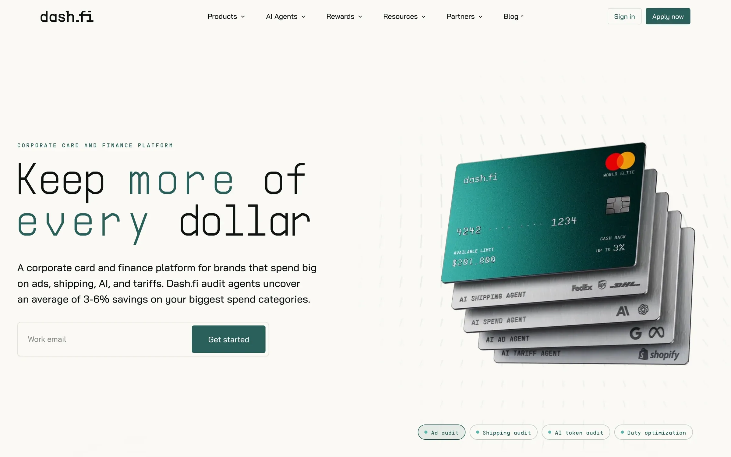
01 At a glance
- 517
- pull requests across the app and the website
- 3
- full product redesigns, plus a Vue 2 → Svelte rebuild
- 44
- website routes rebuilt into one visual language
- 63
- components in Dashbook, the brand & design system
- 2
- brand eras directed: cobalt, then jade
- 4
- AI agent characters with a fixed identity system
02 The app, three redesigns
2024 · First redesign
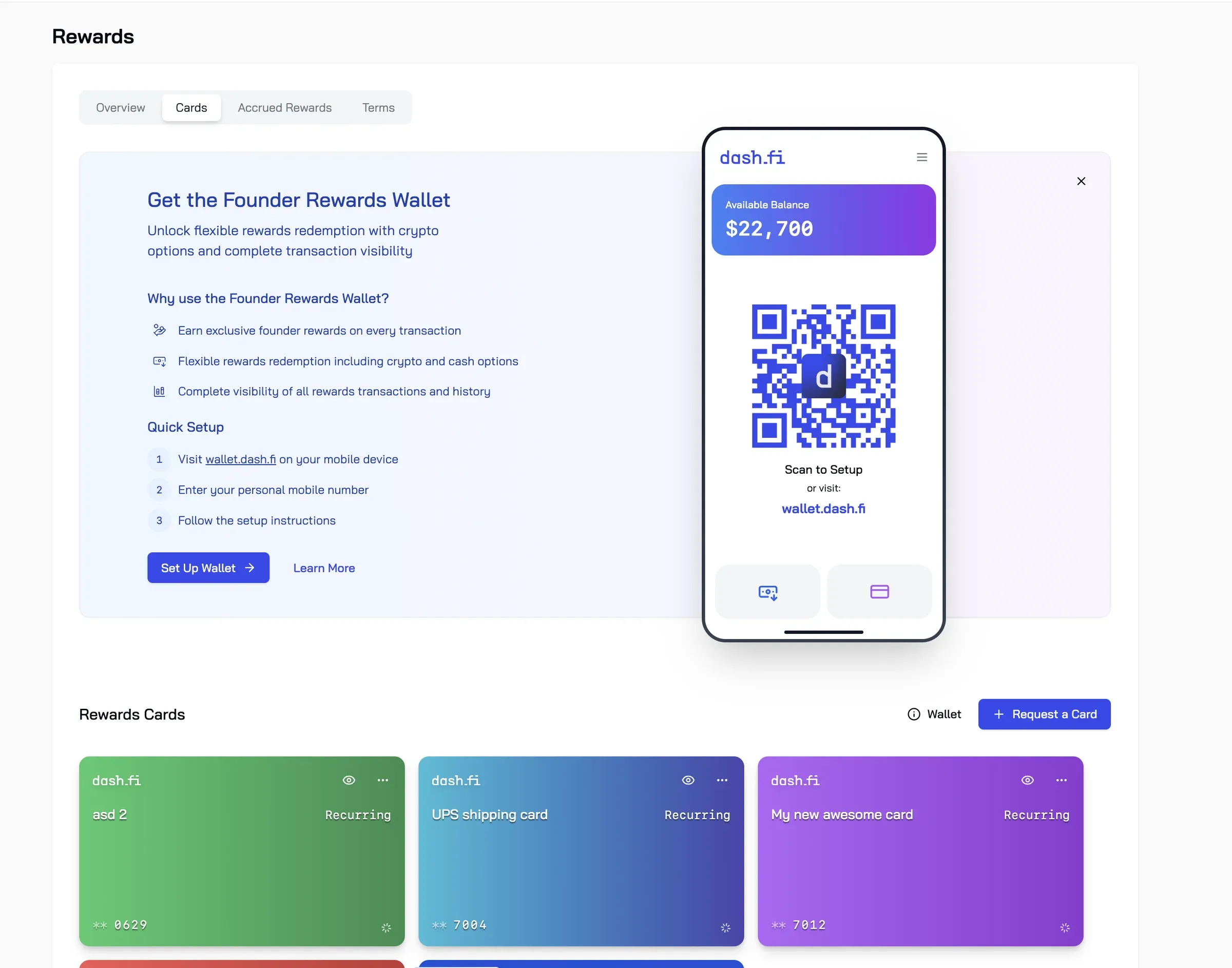
I joined a Vue 2 app with a generic look: Lato, slate-blue headings, a heavy black wordmark, loose lists. I redesigned it end to end in ten iterations over ten days, shipped as one change across 138 files — auth, onboarding, cards, transactions, payments, rewards and settings. New type, a lowercase wordmark, pill tabs, carded surfaces and monospaced figures for money.
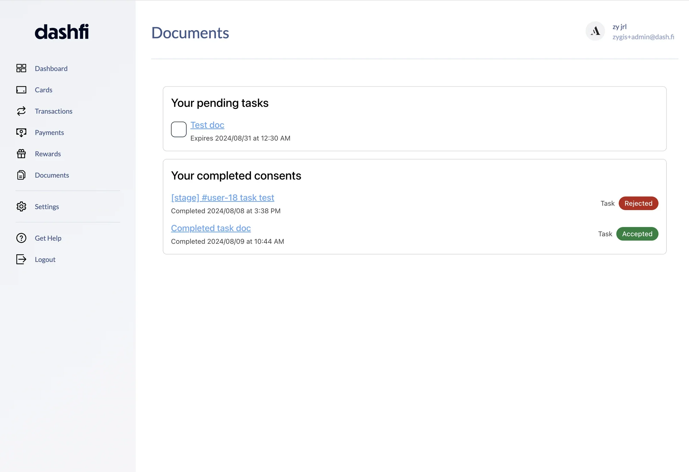
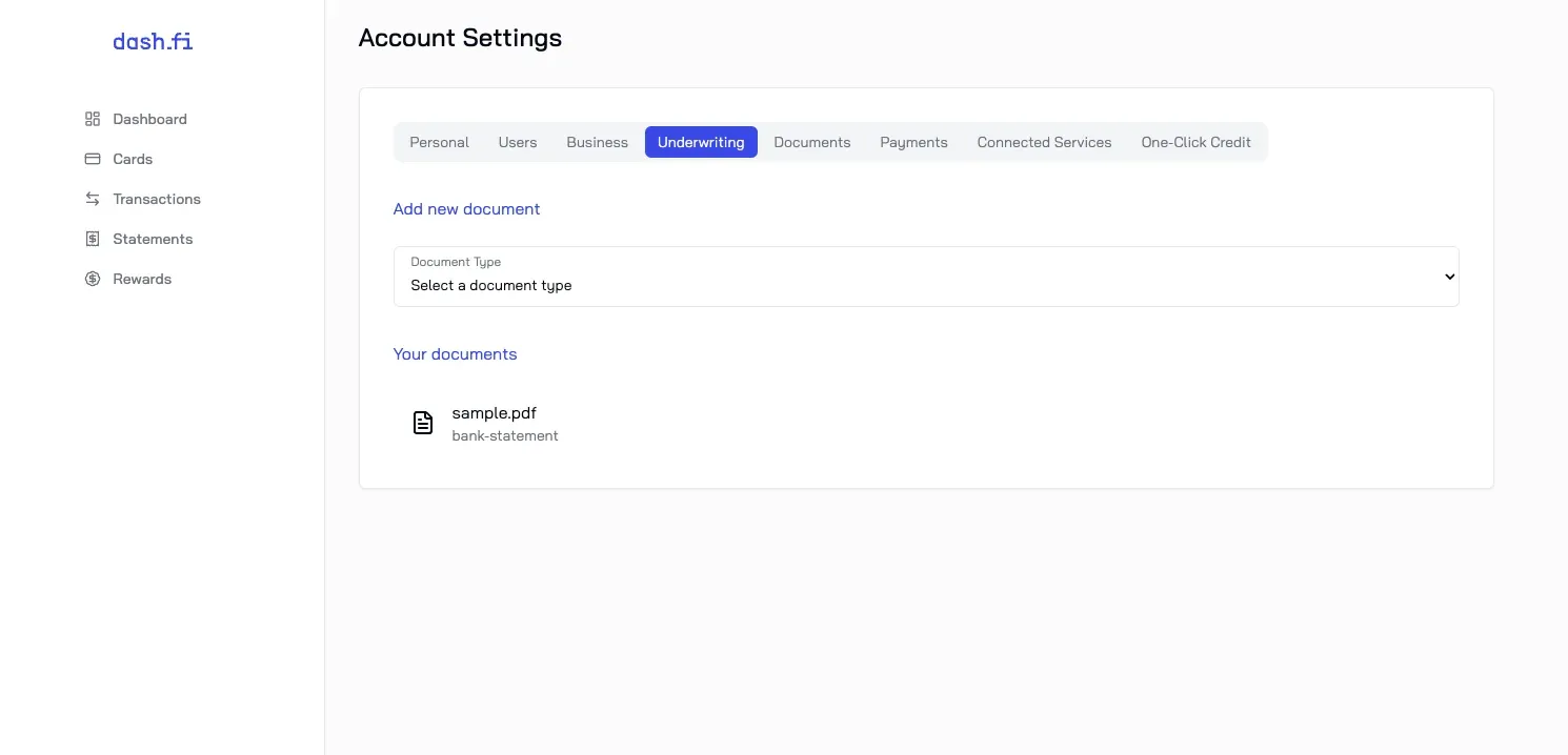
The same documents feature, before and after the 2024 redesign.
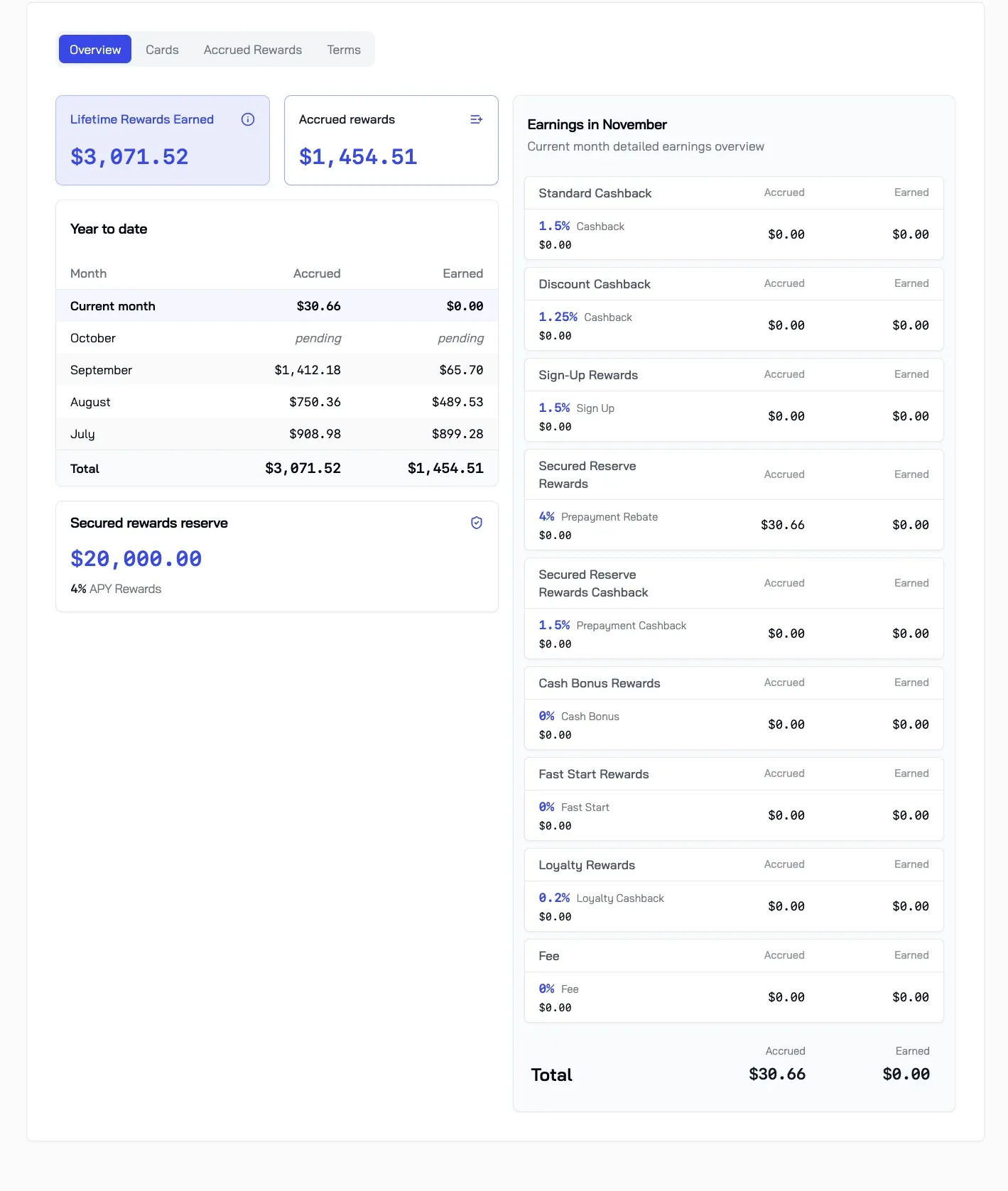
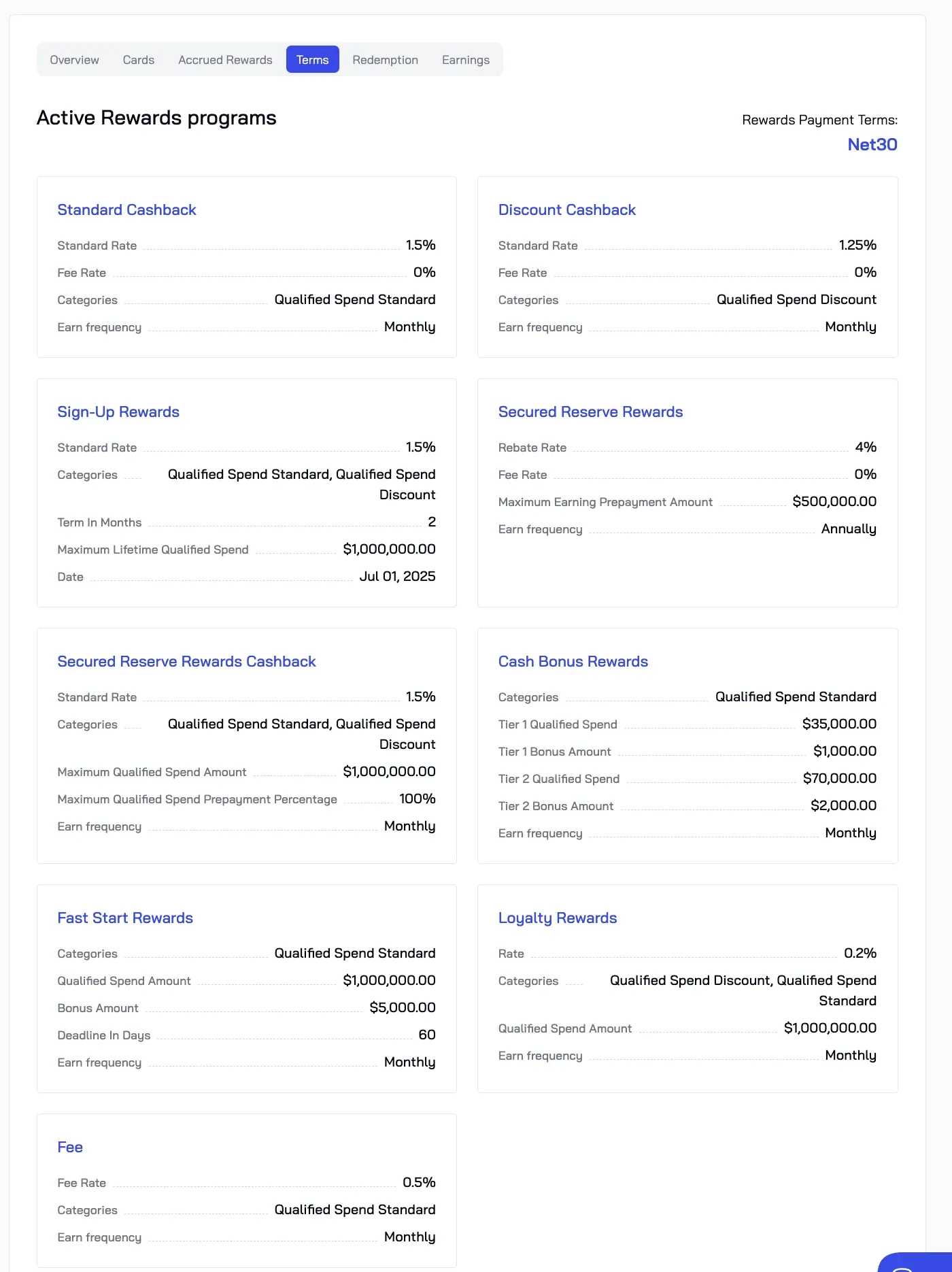
2025 · Rebuilt in Svelte, themeable from day one
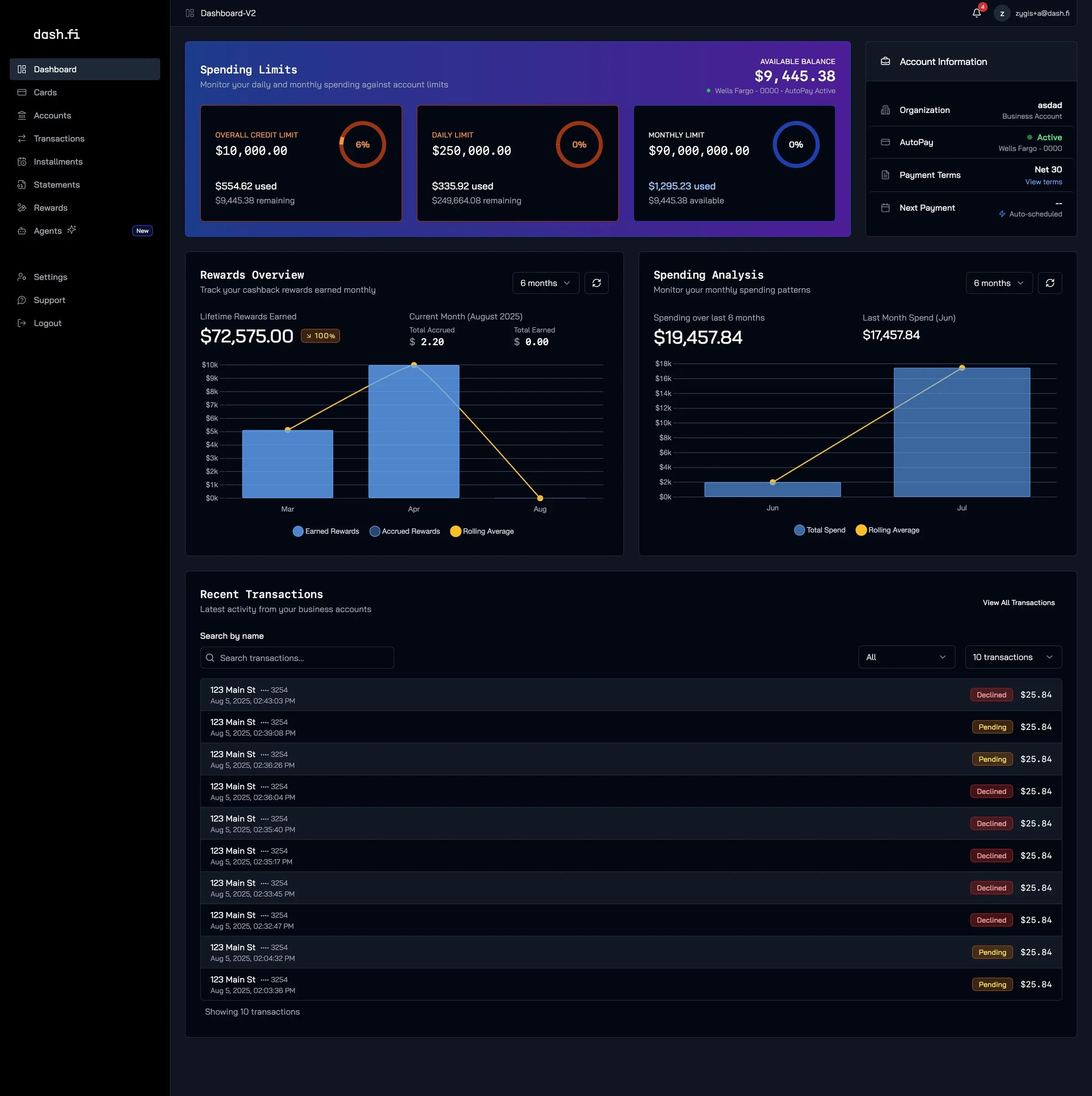
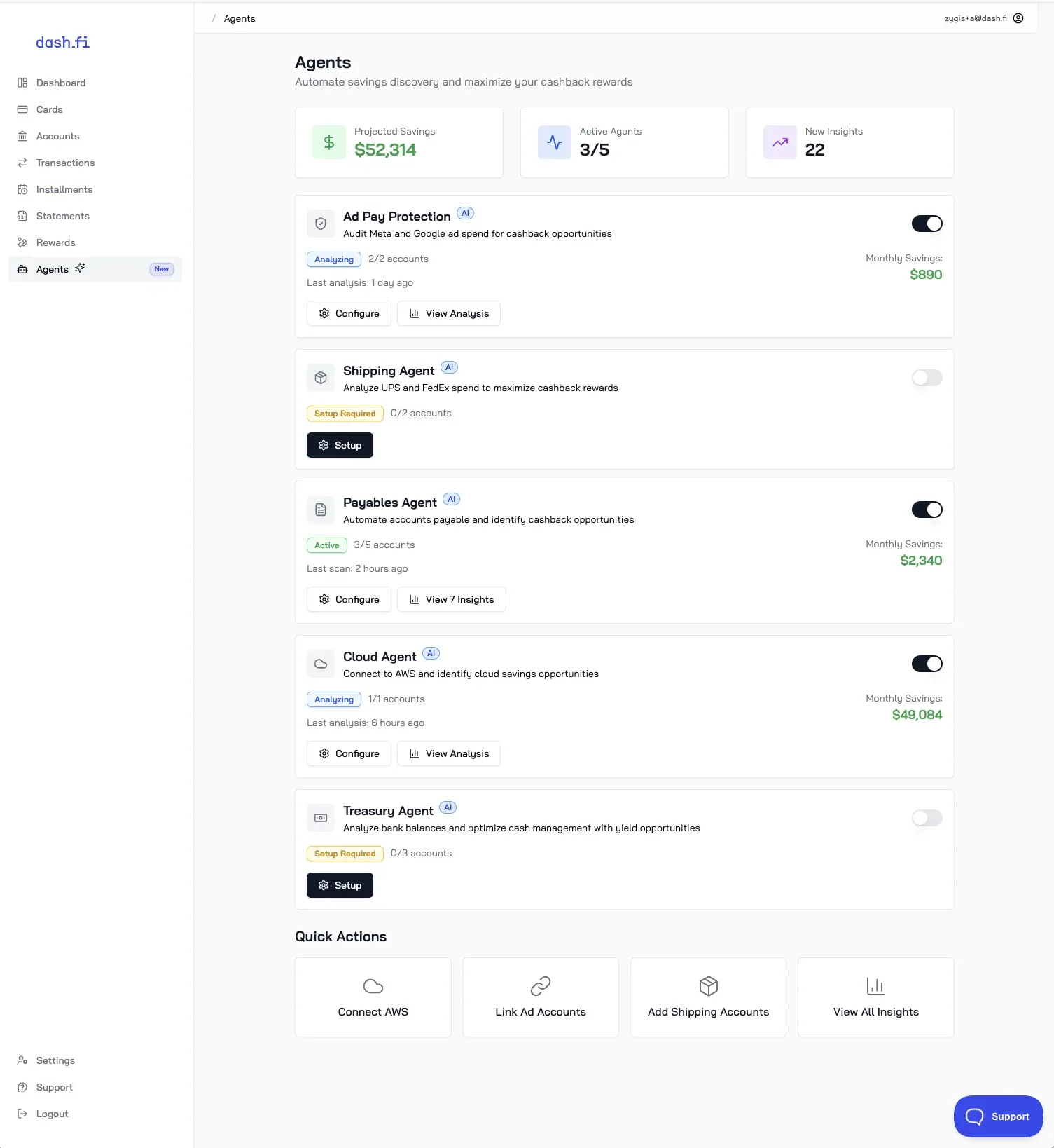
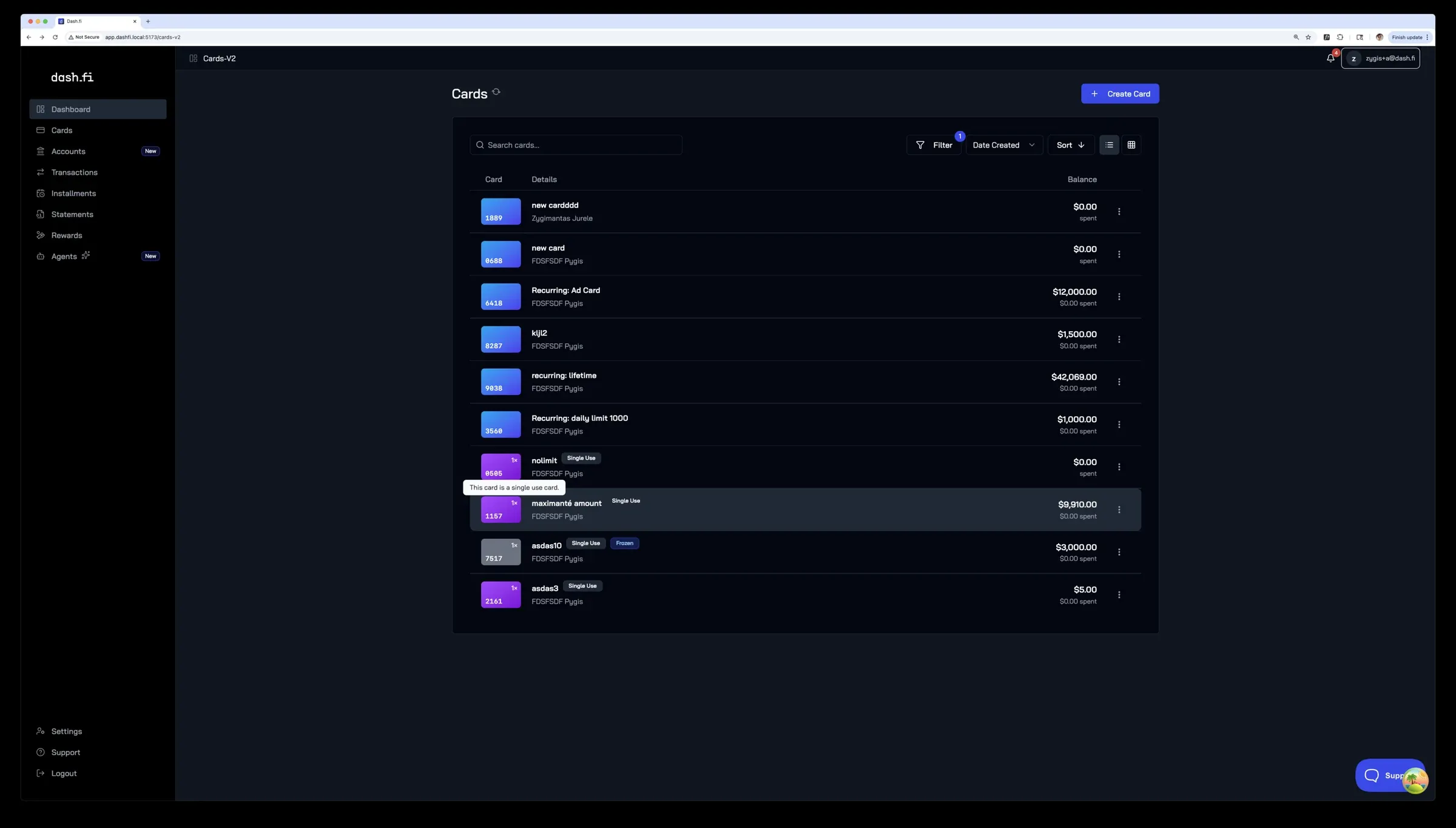
Vue 2 was out of date, and SvelteKit gave the app its own backend-for-frontend, so next I moved it to Svelte. Components came first — a shared library before any page moved — then the pages went over one by one: rewards, dashboard, transactions, installments, cards, auth. A banner in the old app told customers the new one was coming. Everything shipped in light and dark.
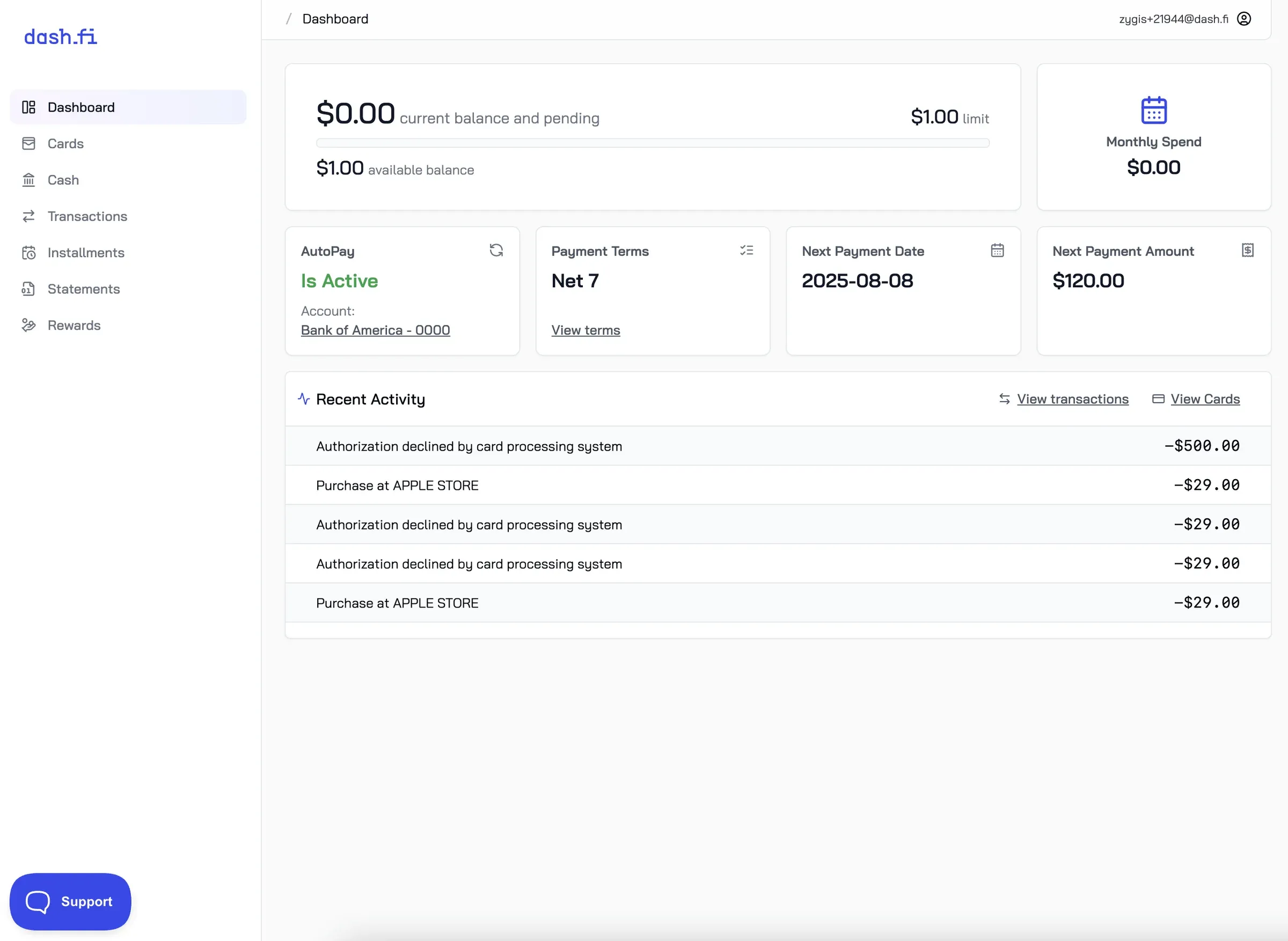
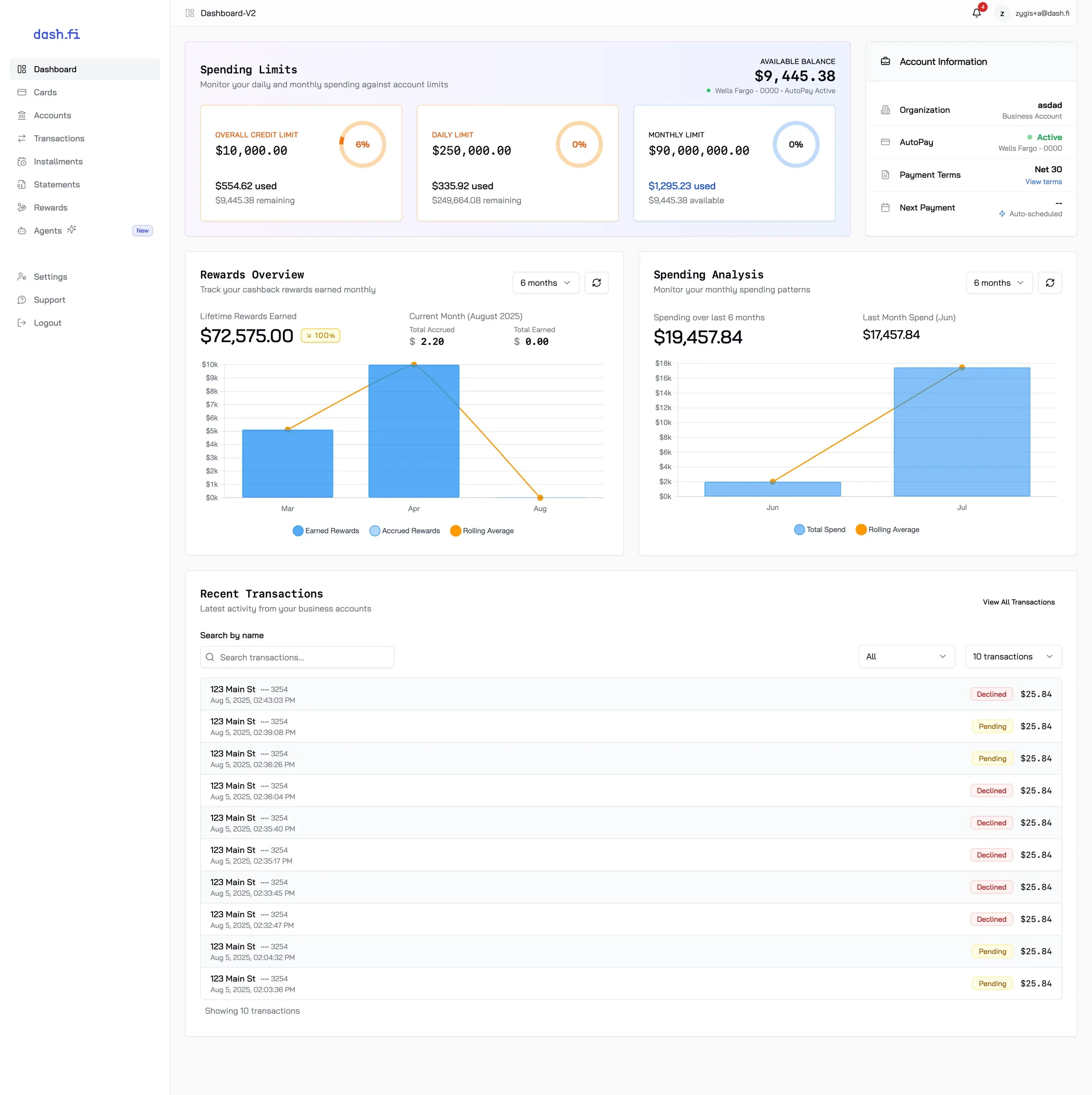
Dashboard v2 replaced flat stat tiles with limit gauges and spend charts.
2025 · Systems before screens
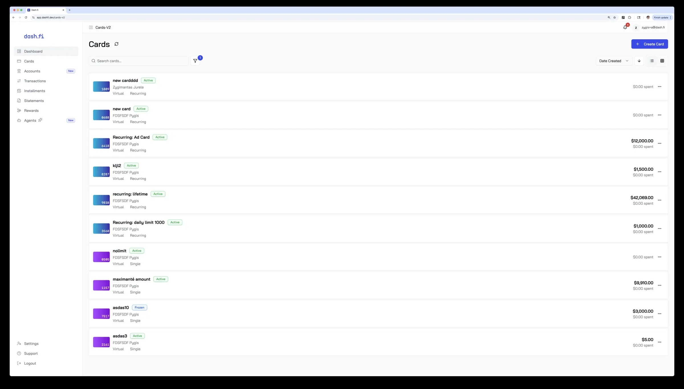
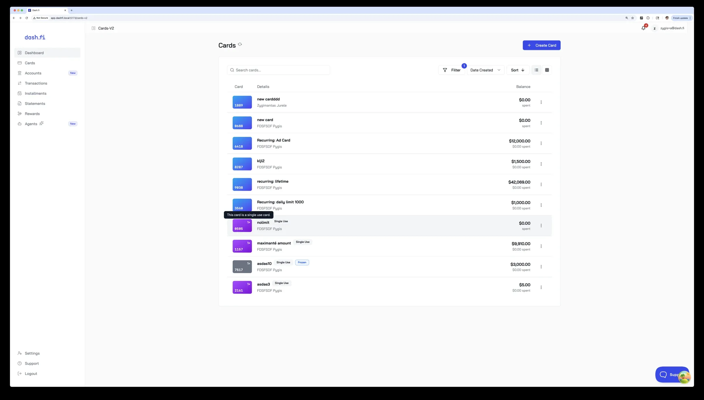
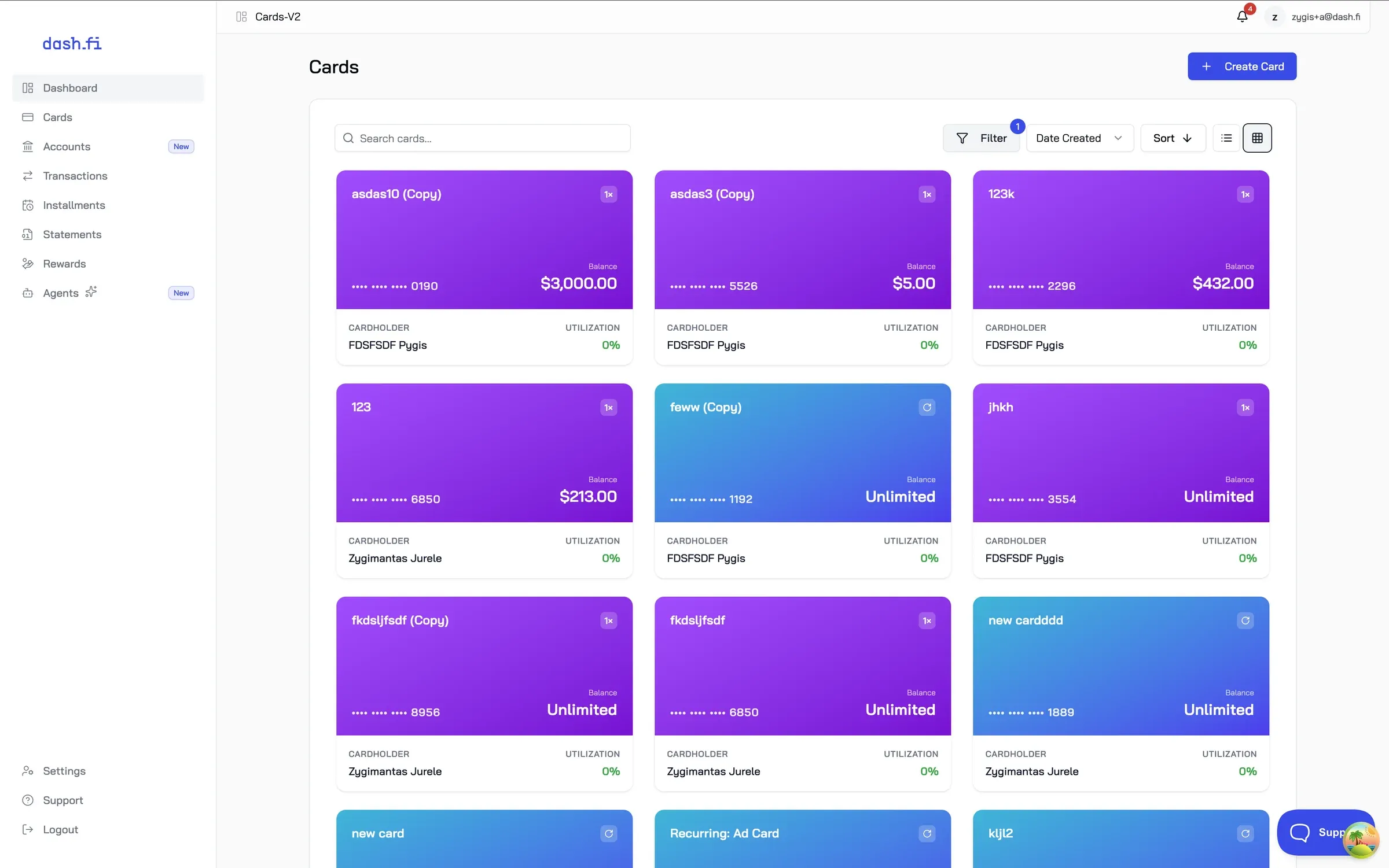
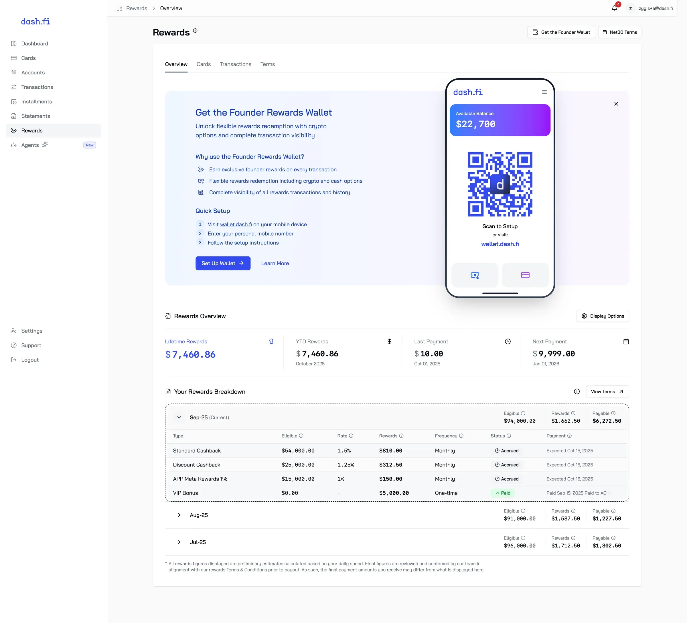
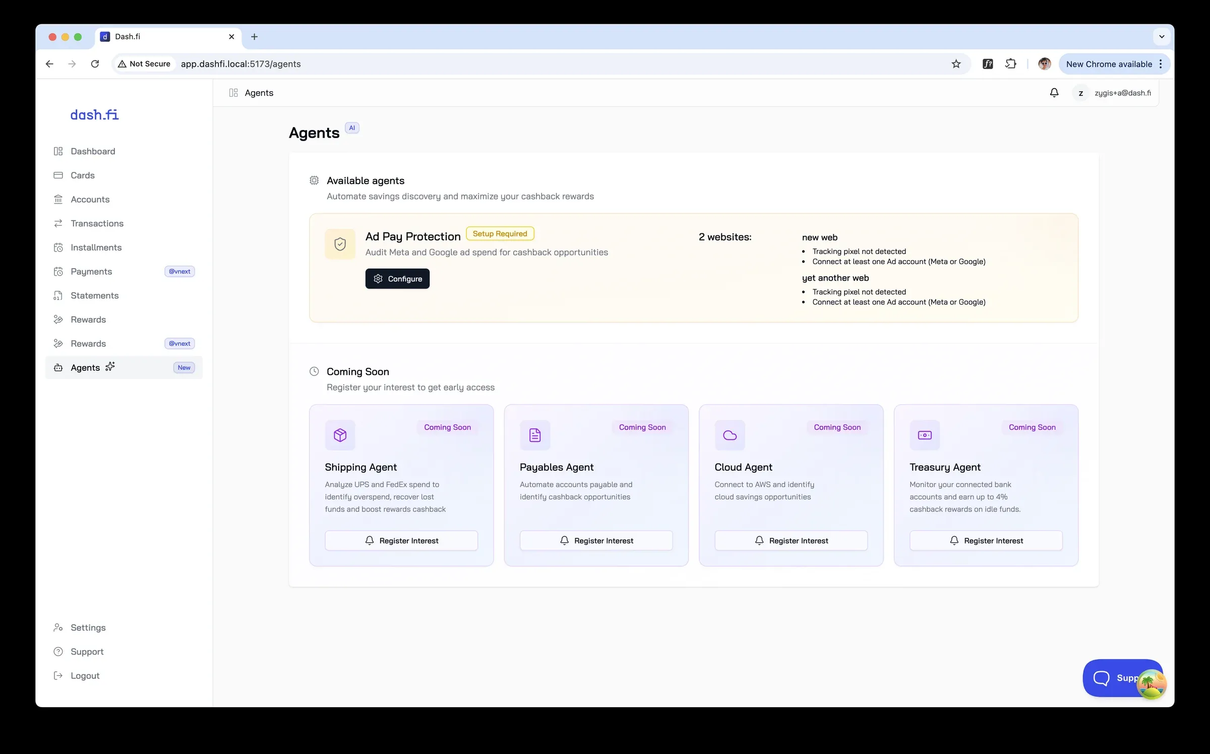
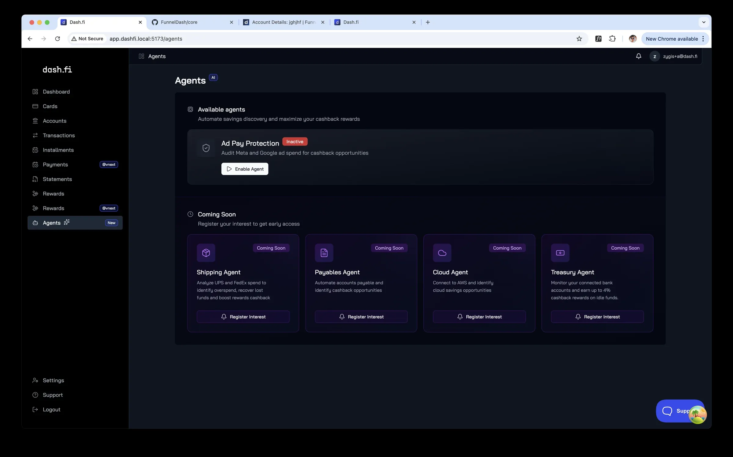
Before the next visual pass I built the foundation: Storybook, Tailwind v4, one shared token set and a hosted brand book. Then I rebuilt every core surface on it behind parallel routes, so the redesign shipped incrementally instead of in one big launch. Cards got a colour system — blue recurring, purple single-use, grey frozen — and Rewards a new information architecture.
2026 · Jade
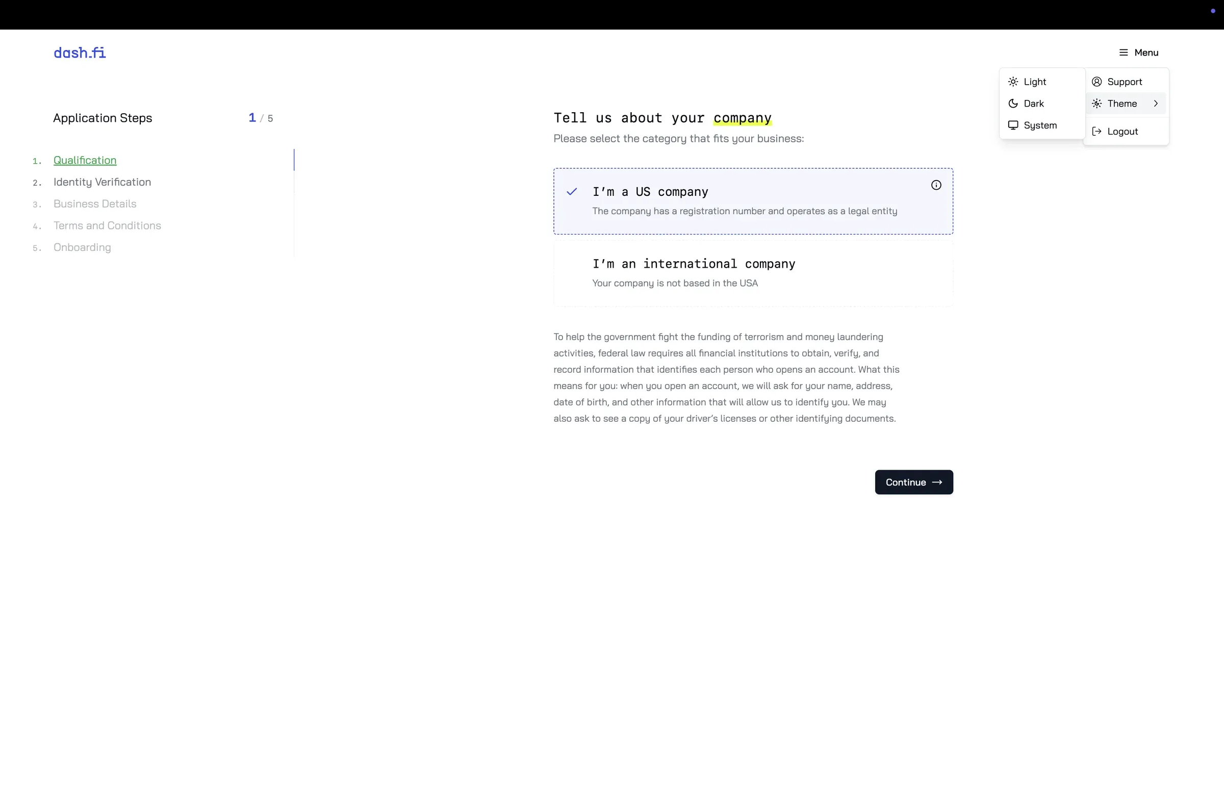
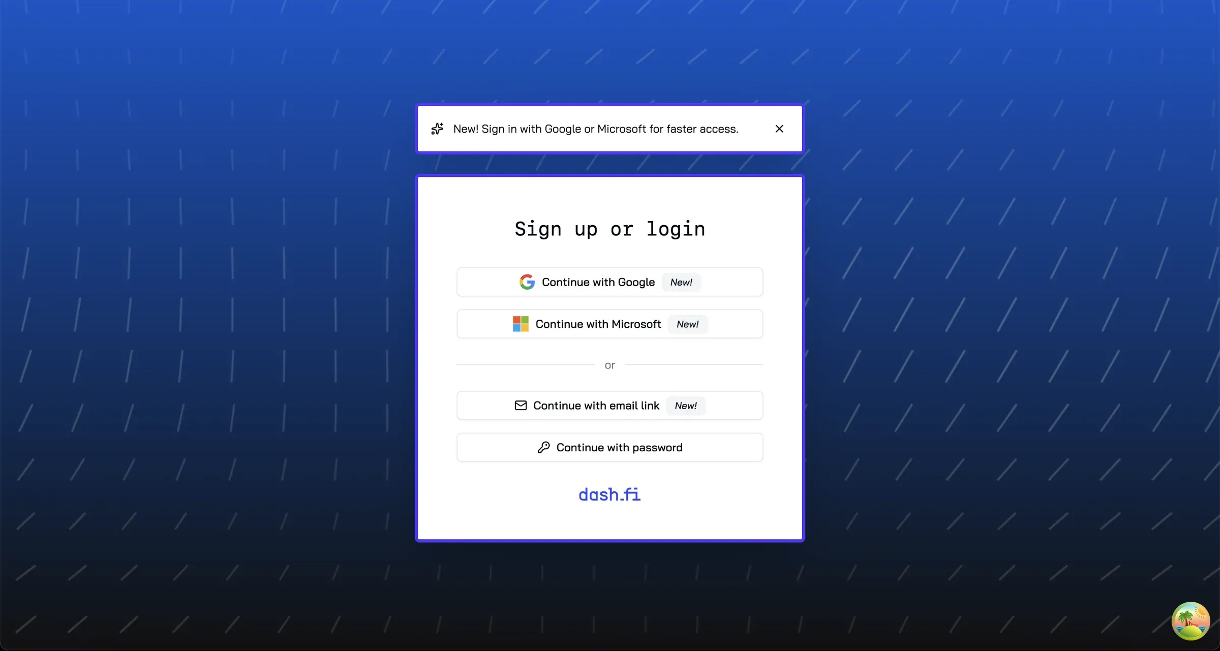
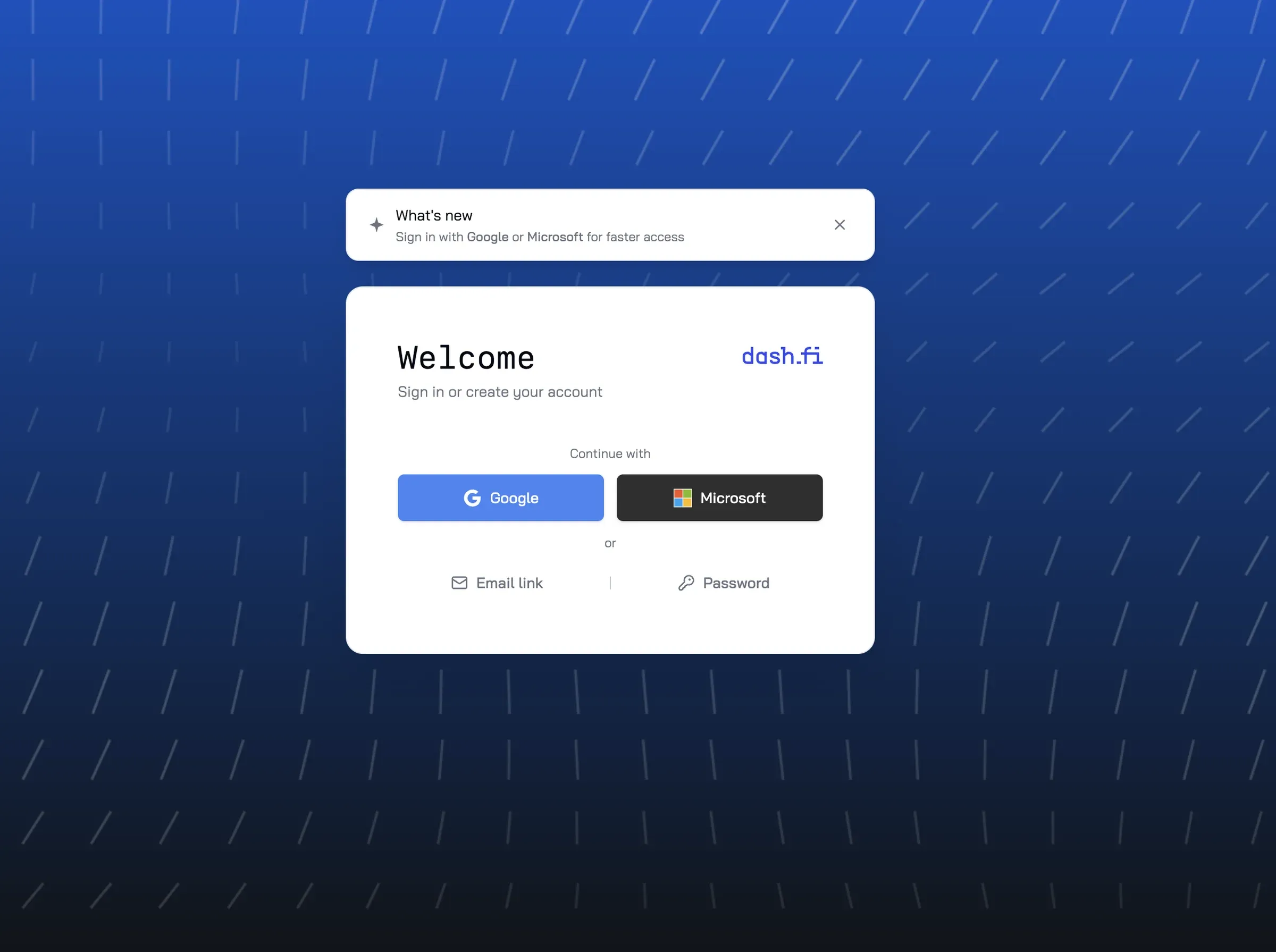
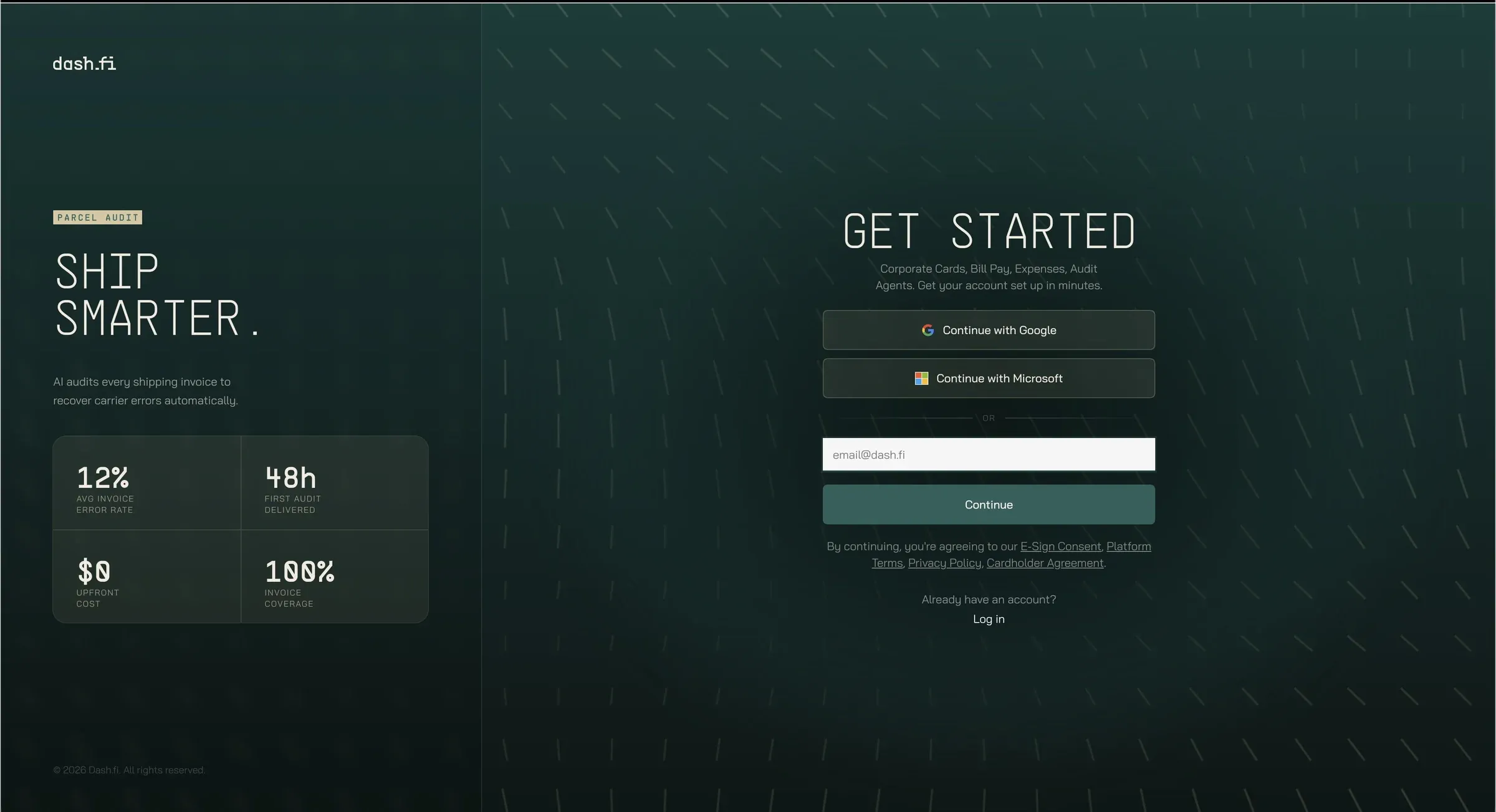
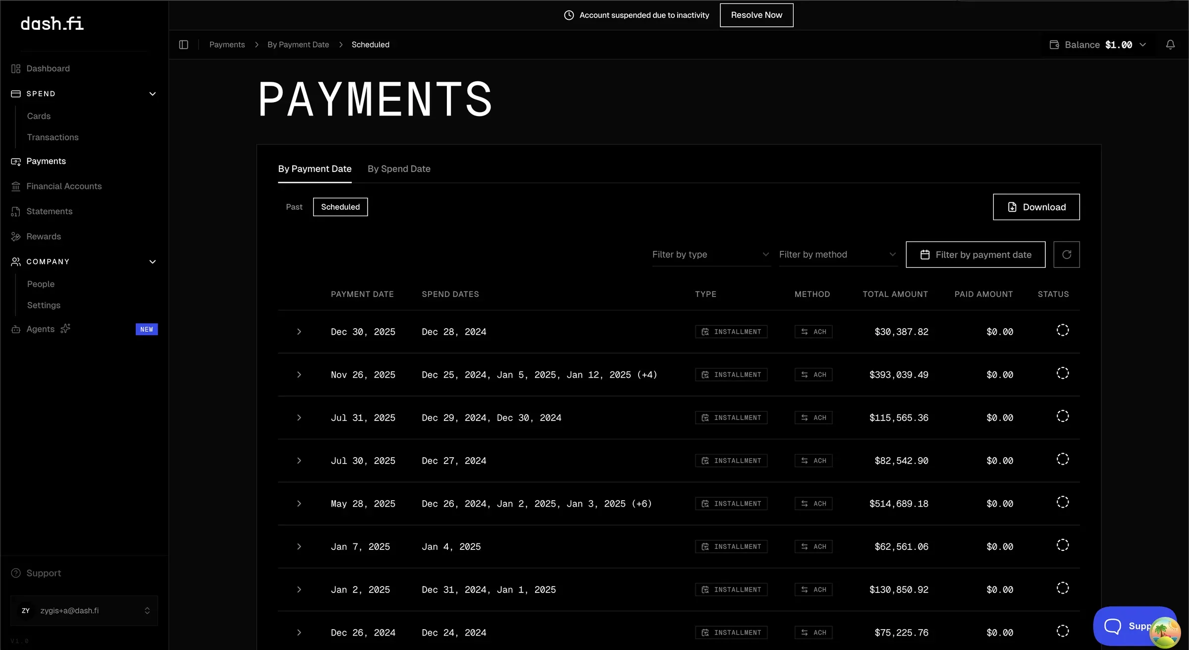
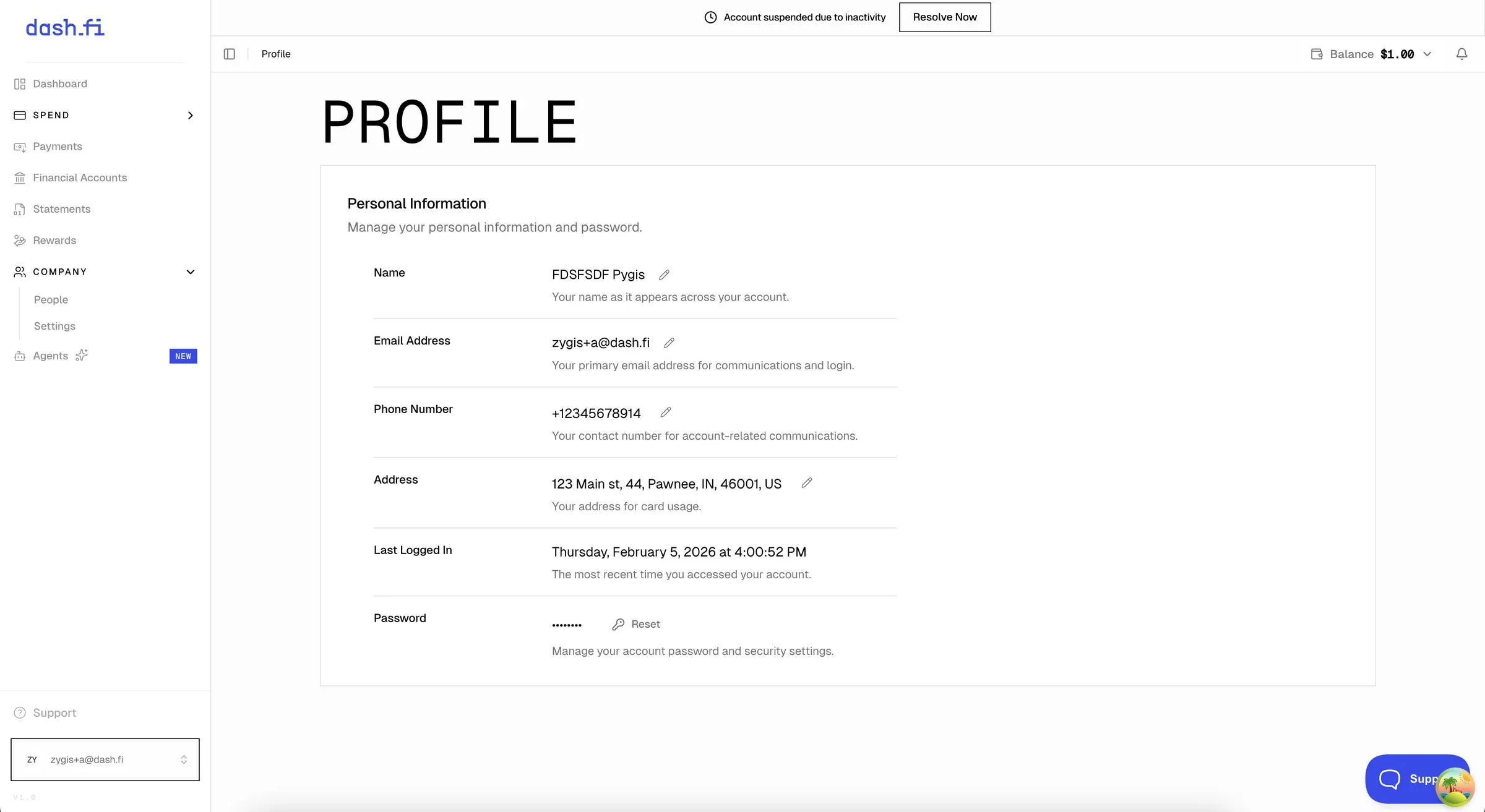
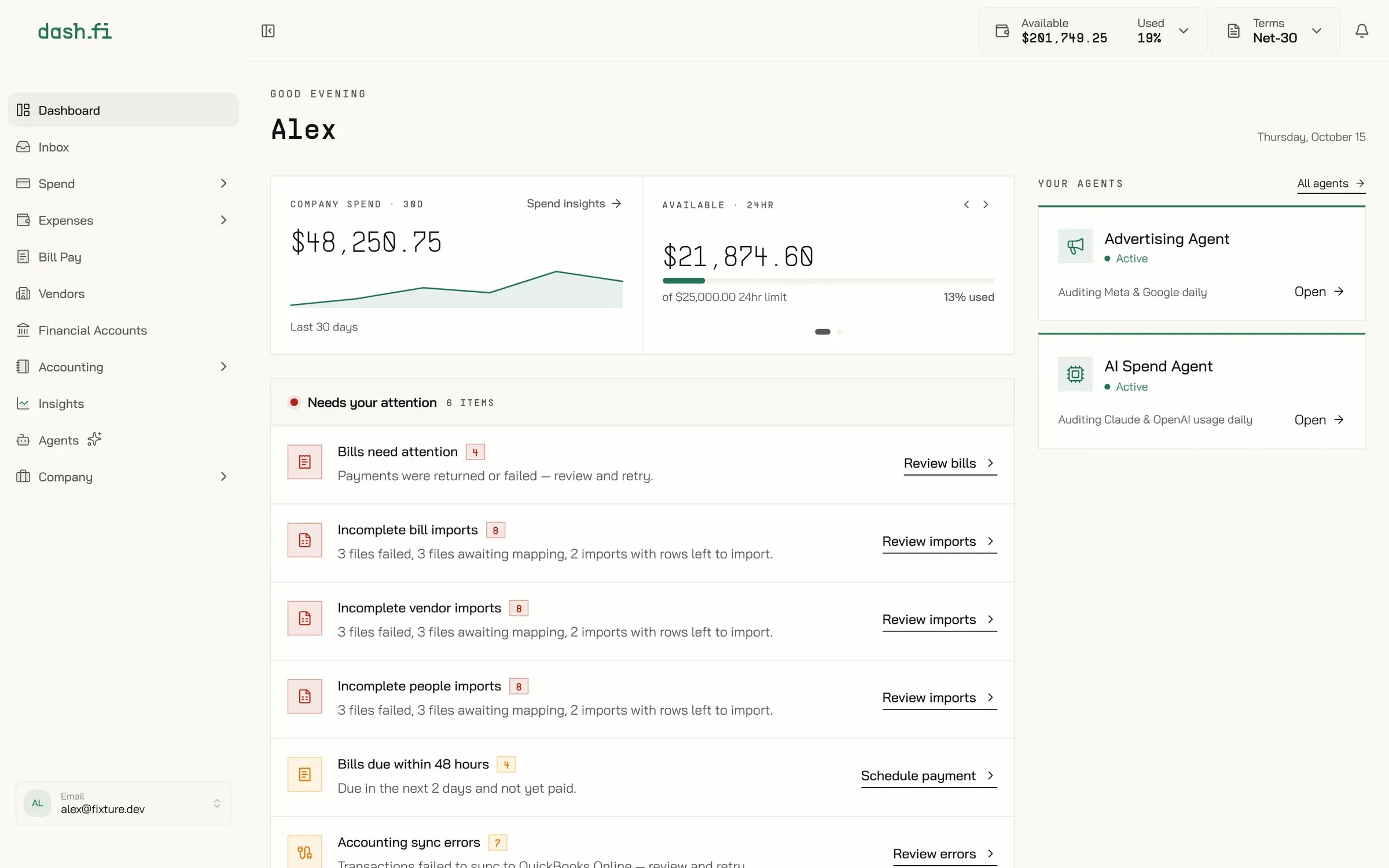
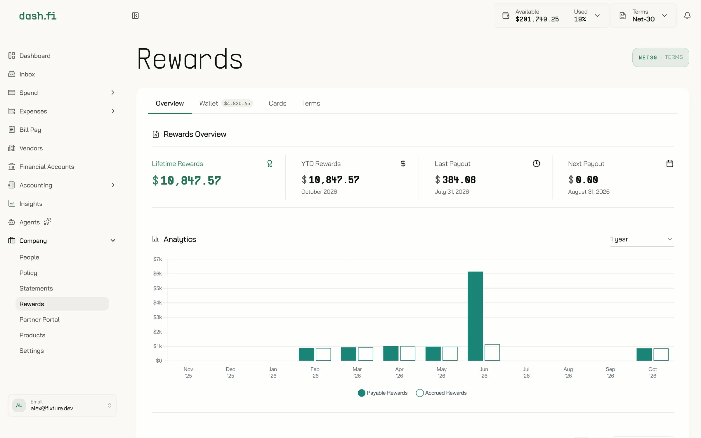
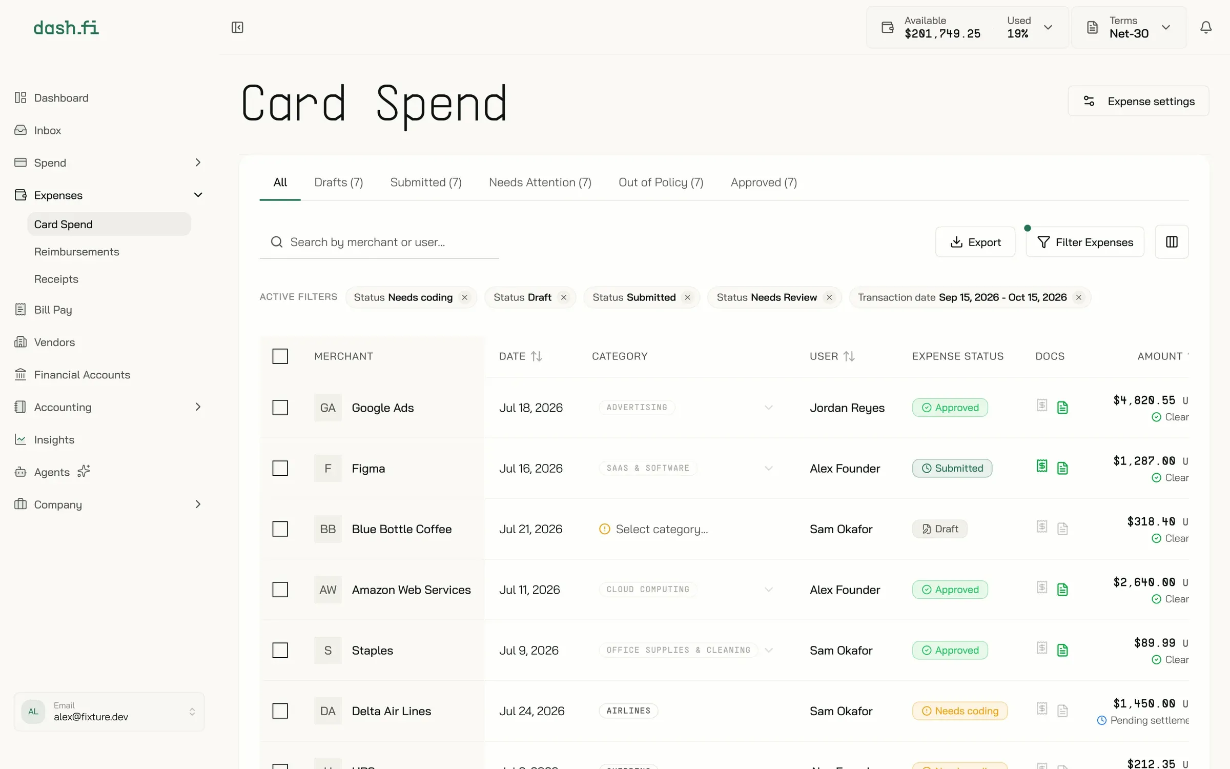
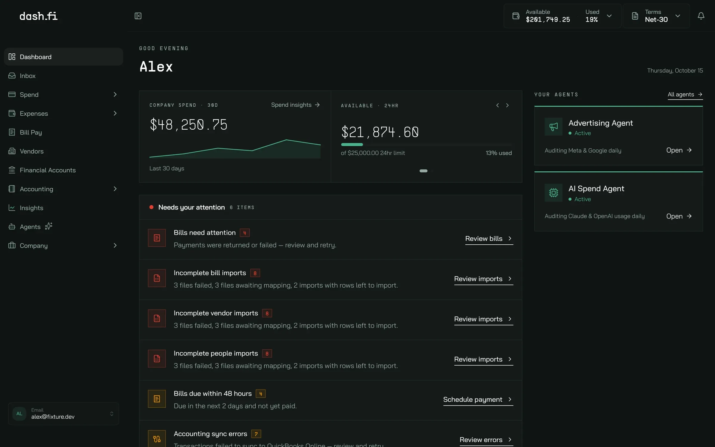
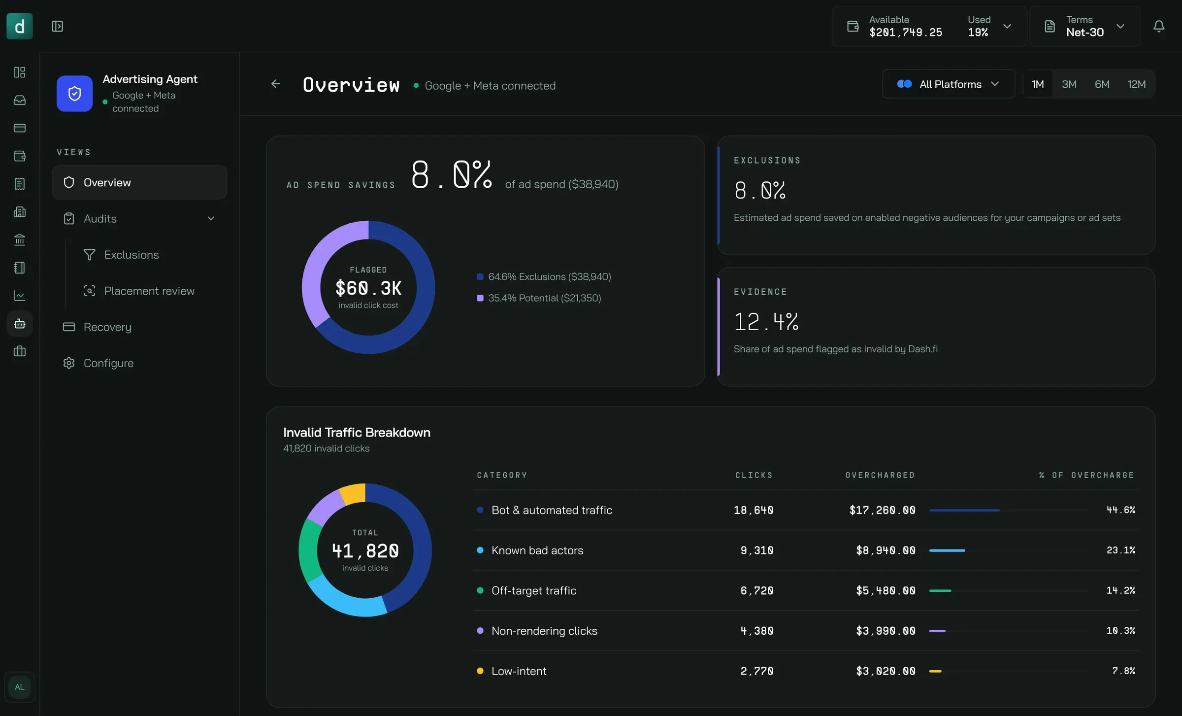
I first explored a stark, all-mono, high-contrast direction, which didn’t ship. What shipped was a warm cream and jade palette, a full dark-mode token set, Bai Jamjuree with PP Supply Mono, and new page-header and panel patterns — 187 files, every signed-in route. The sign-in screen shows the three eras in one place.
The app today
Every signed-in surface, in light and dark. Captured from staging in October 2026 with sample data.
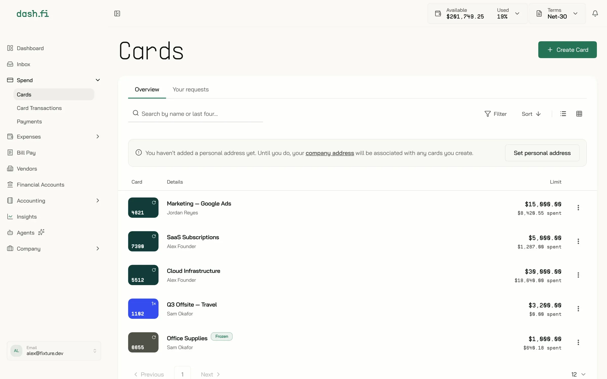
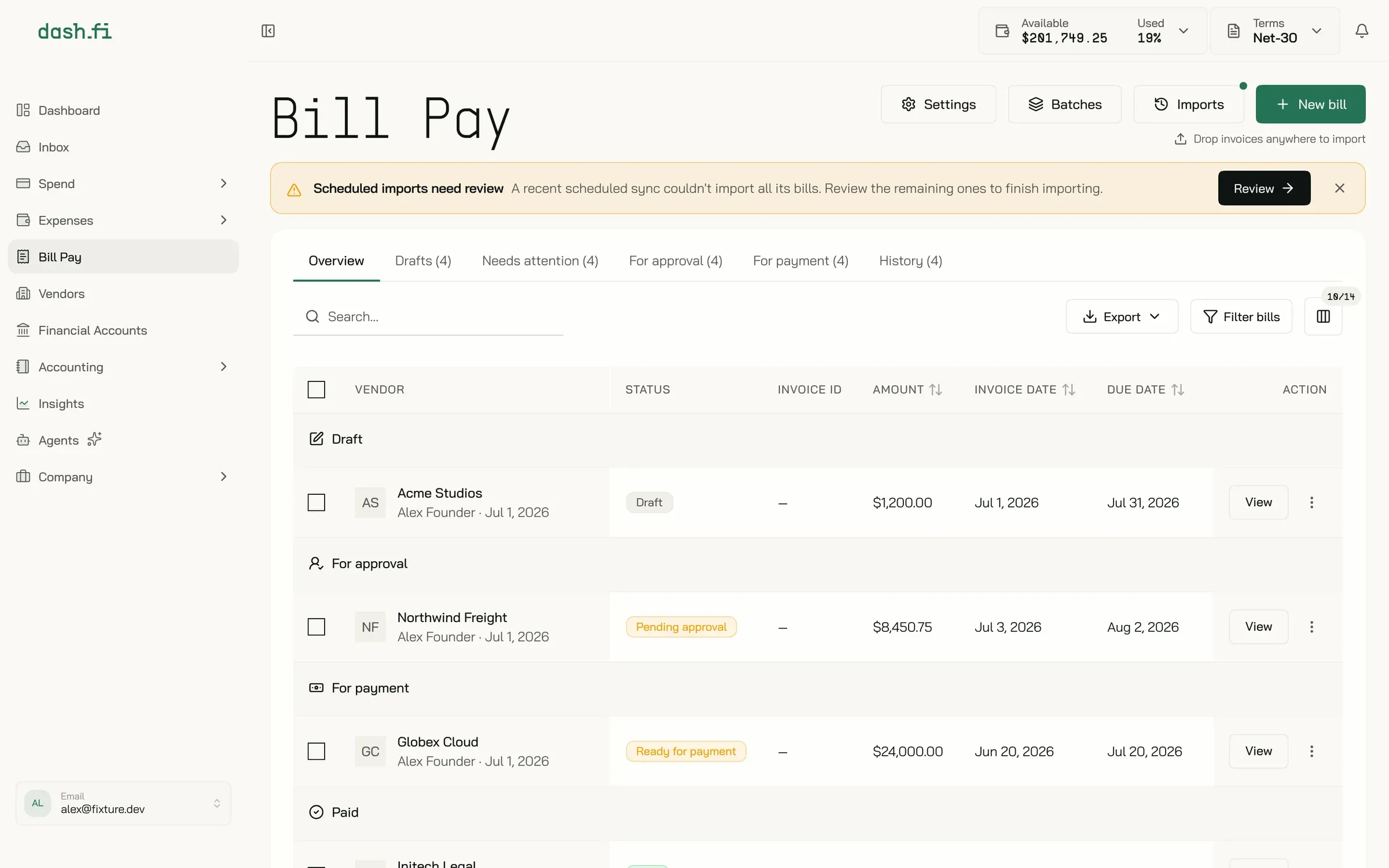
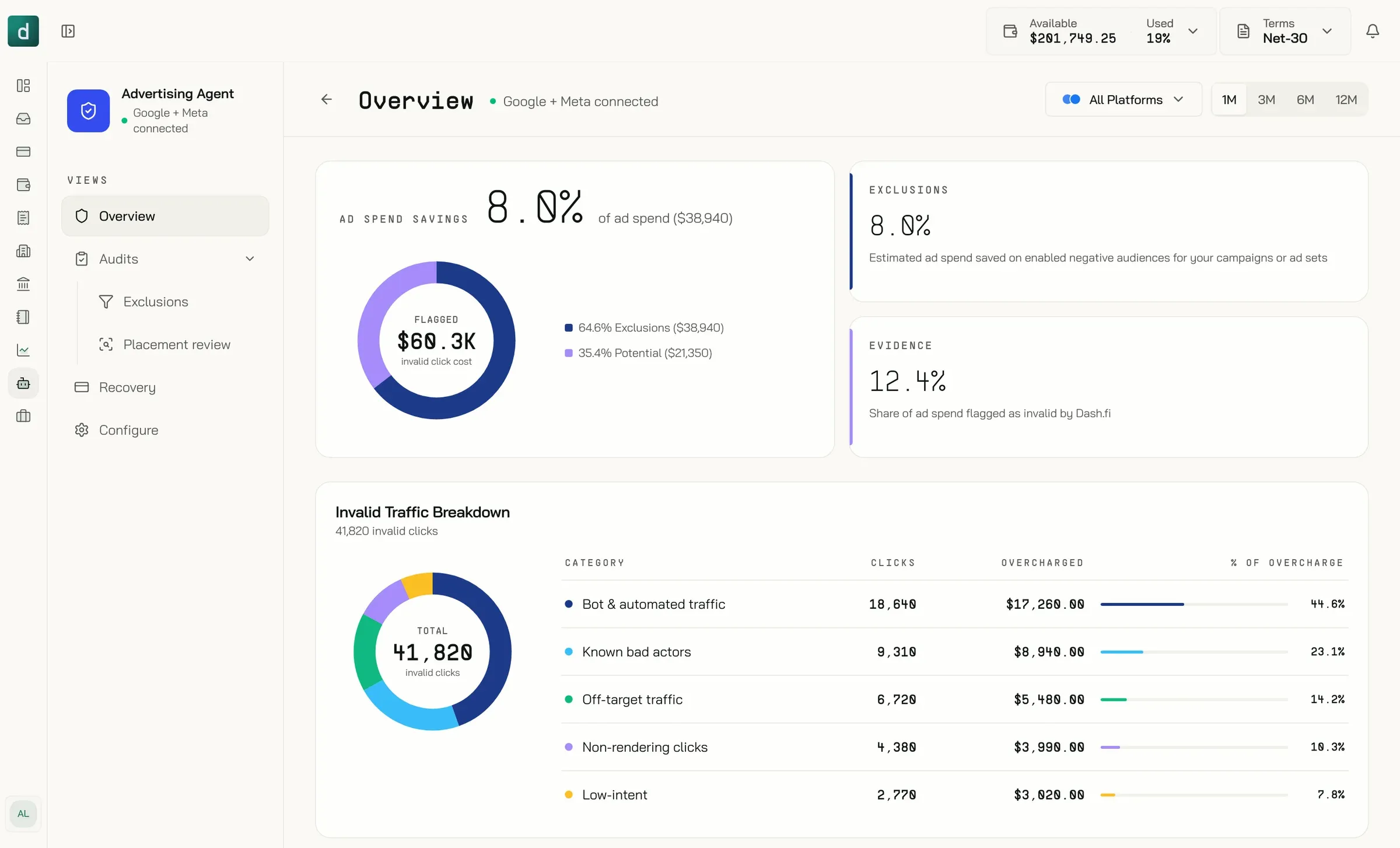
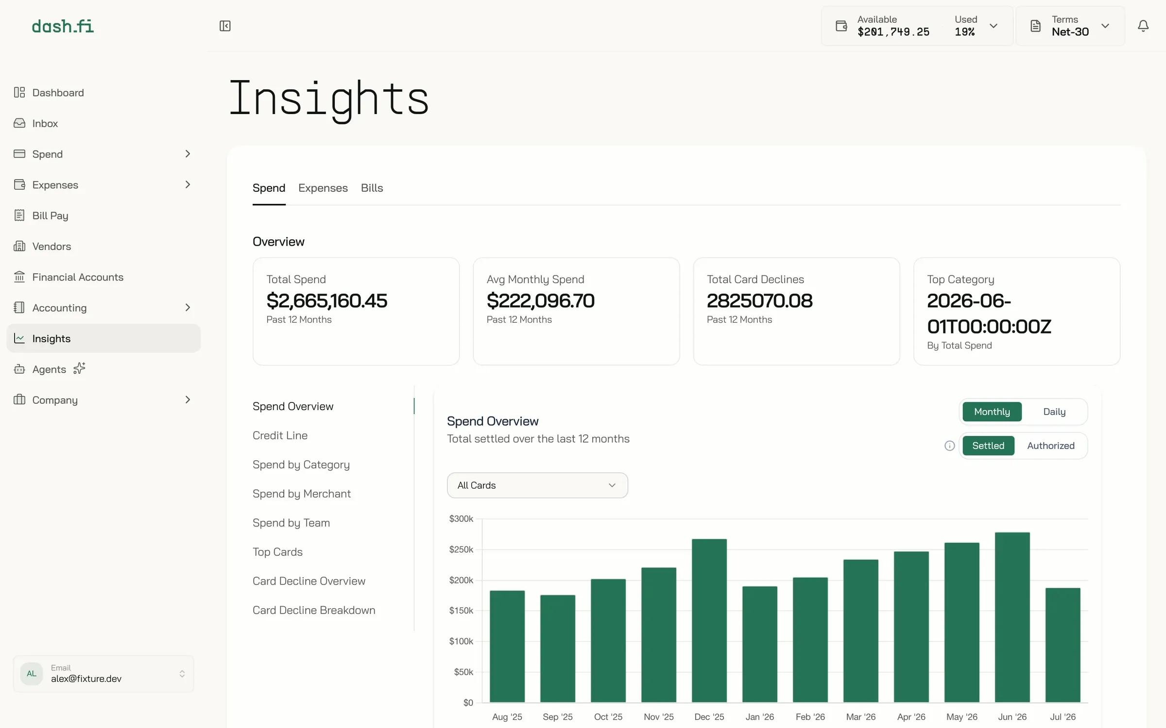
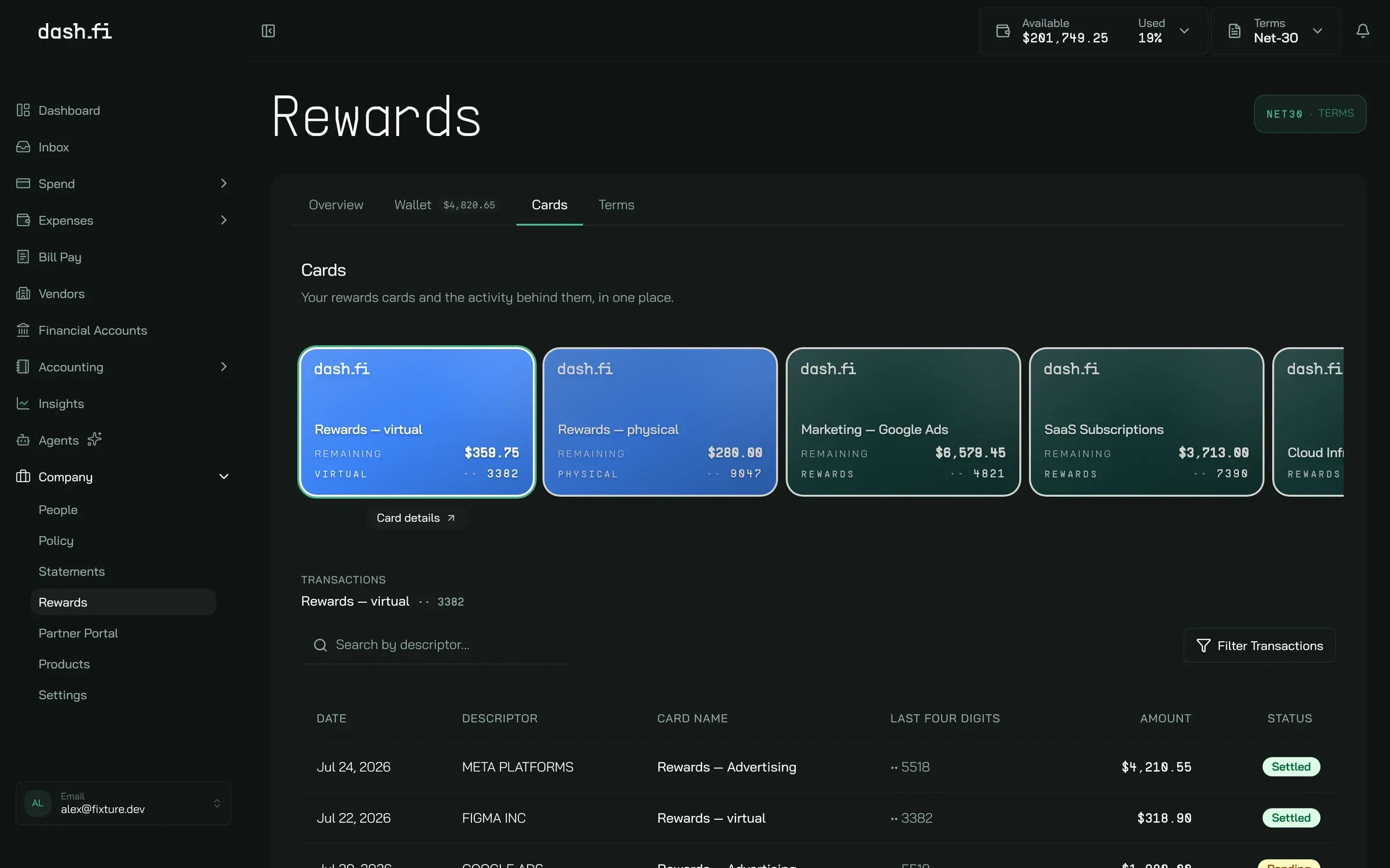
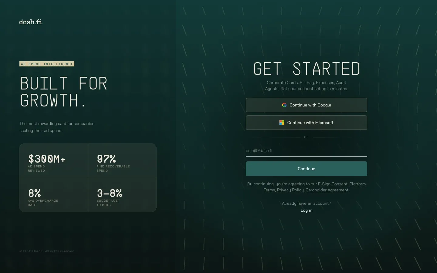
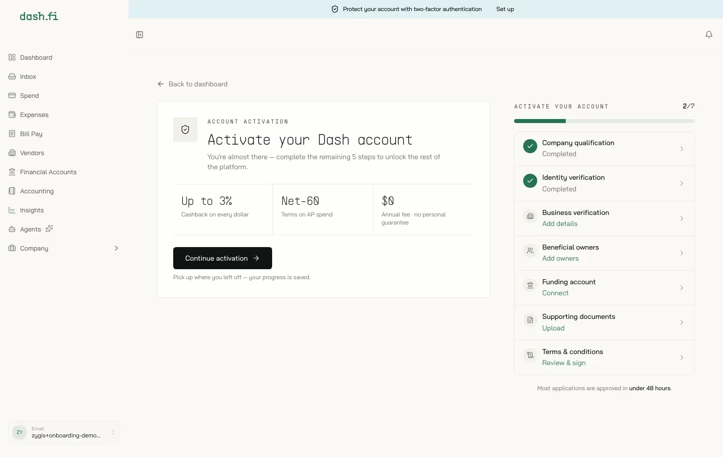
03 www.dash.fi
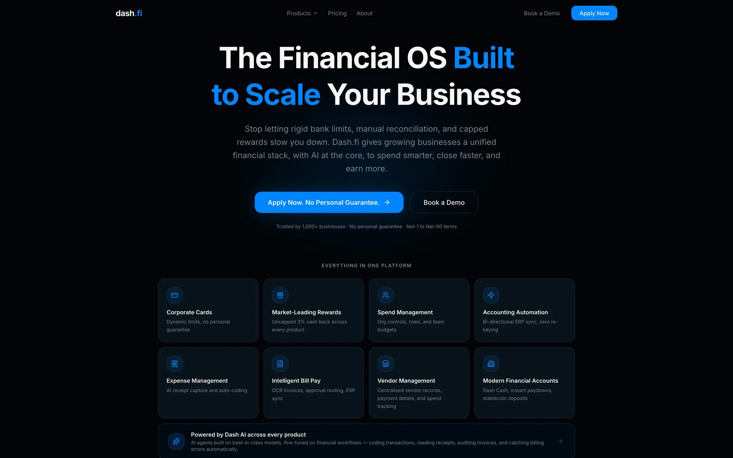
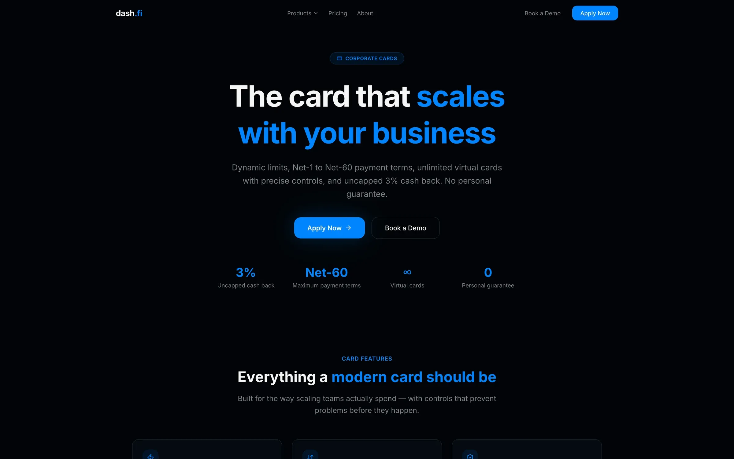
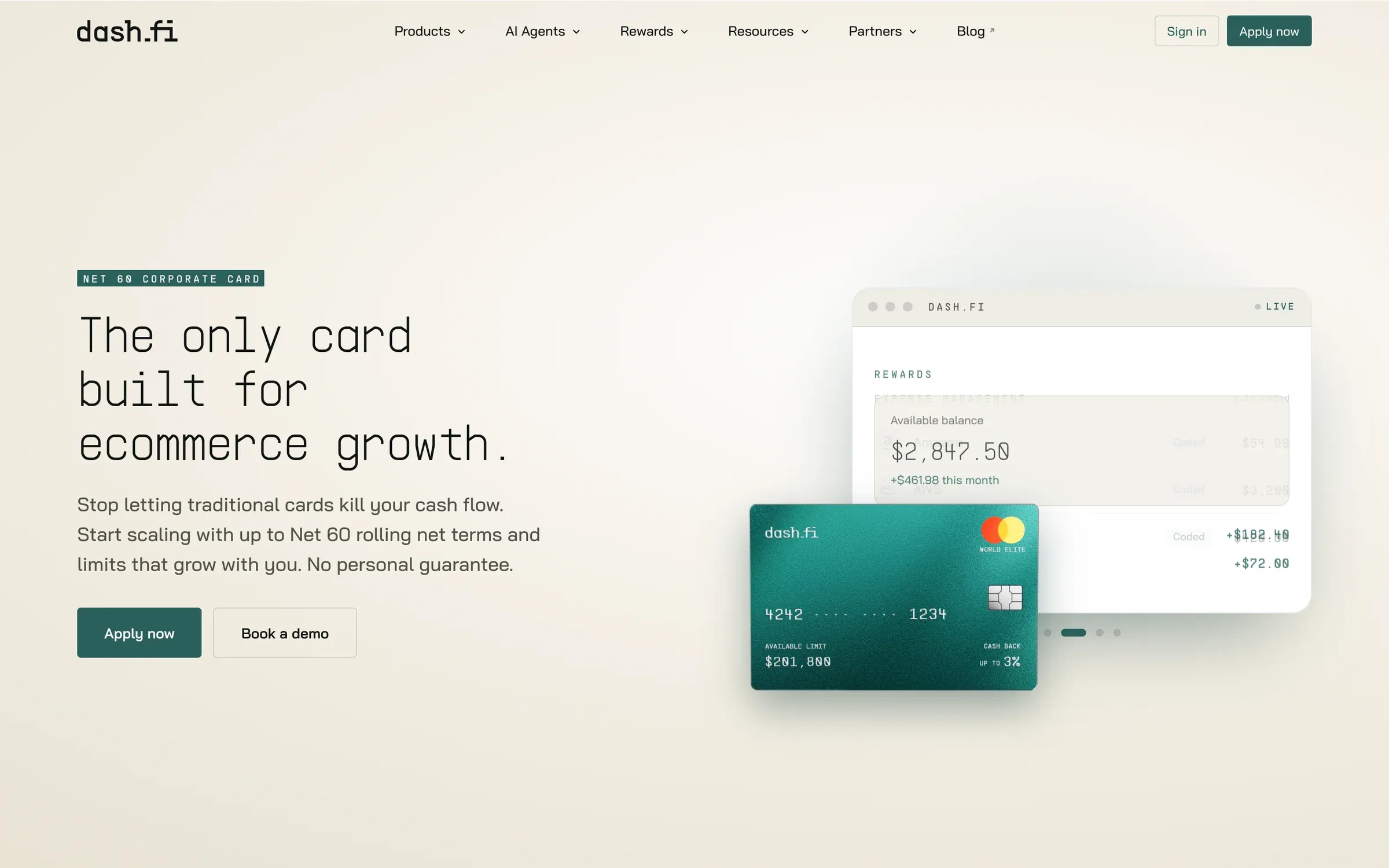
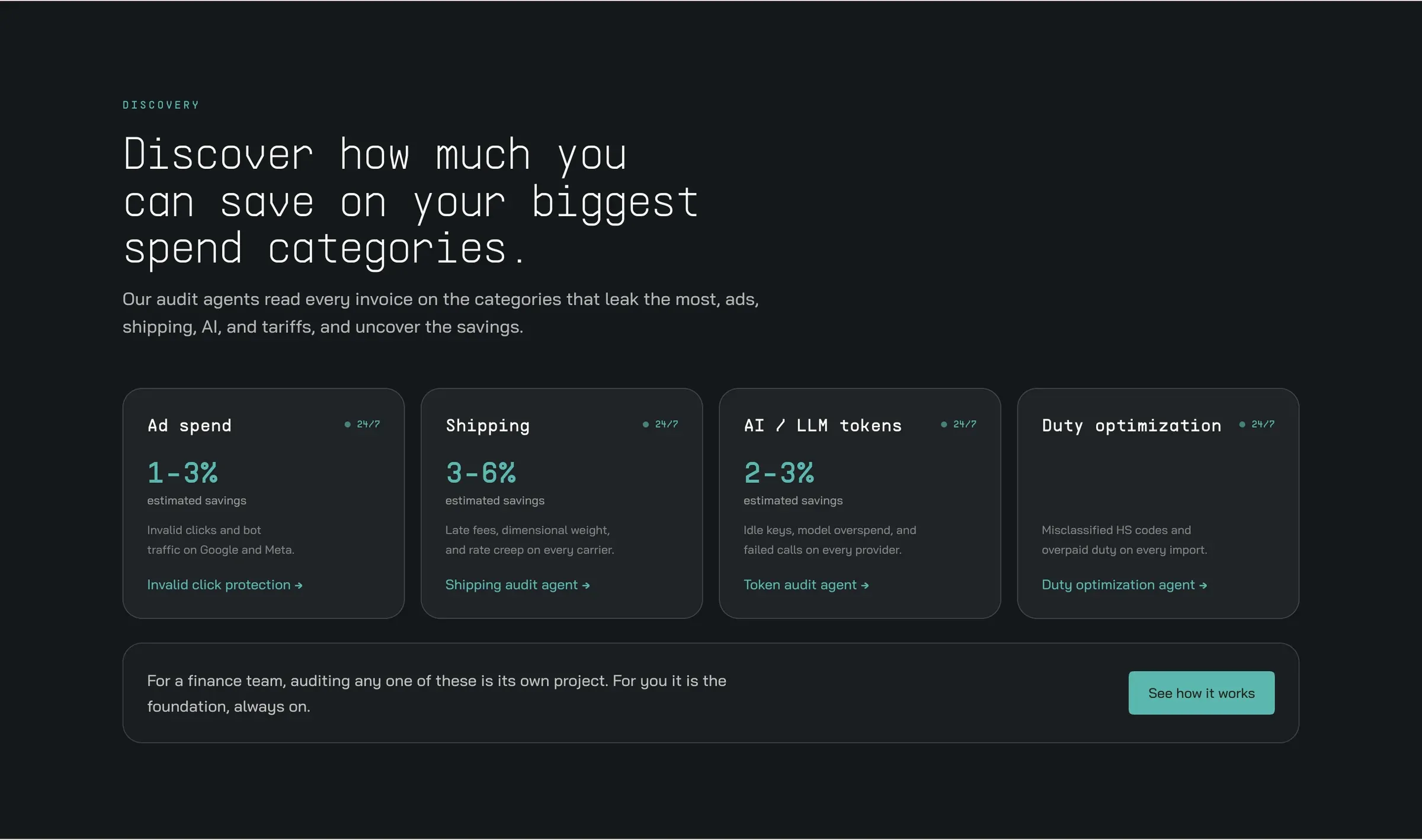
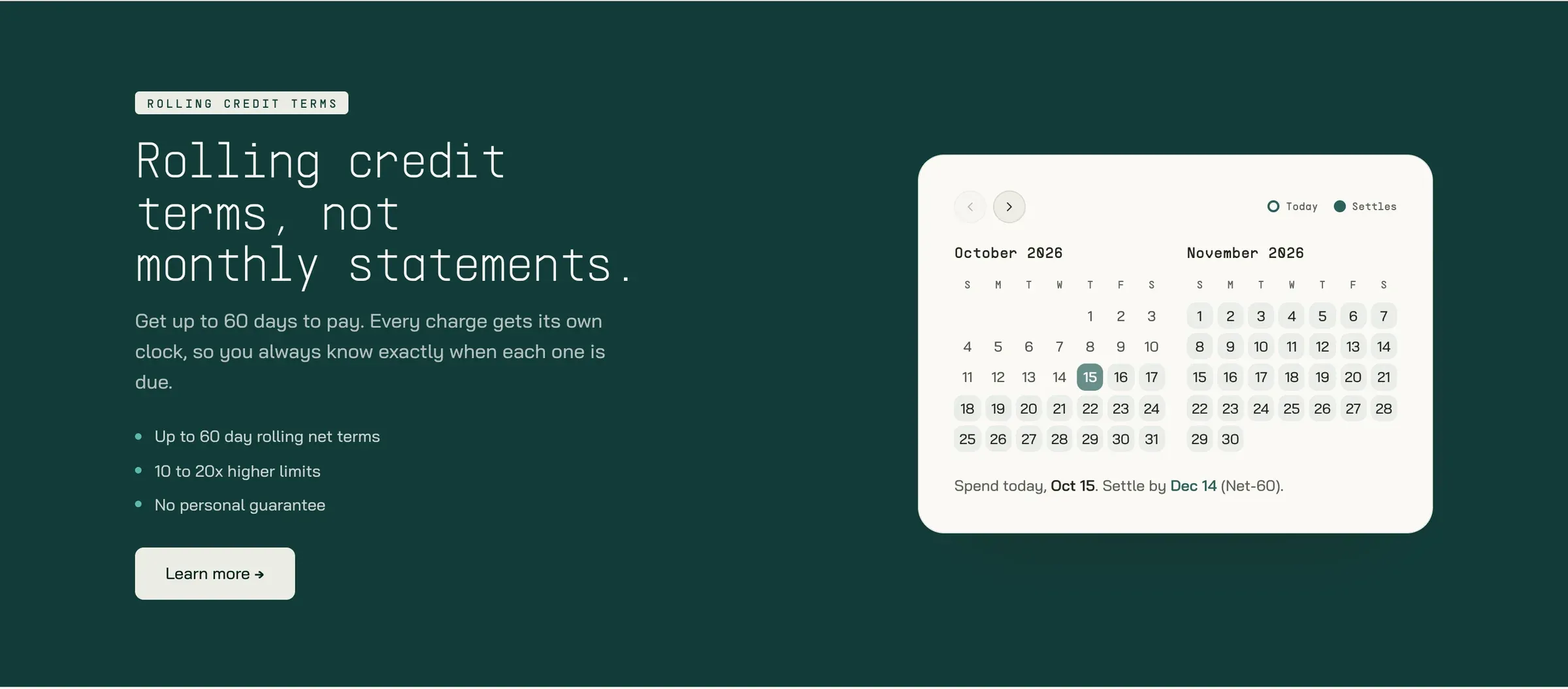
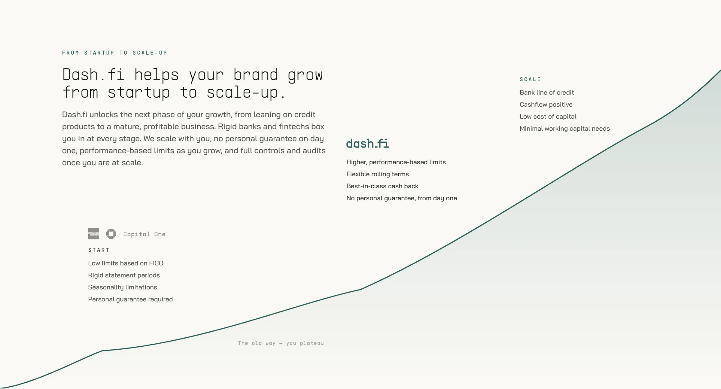
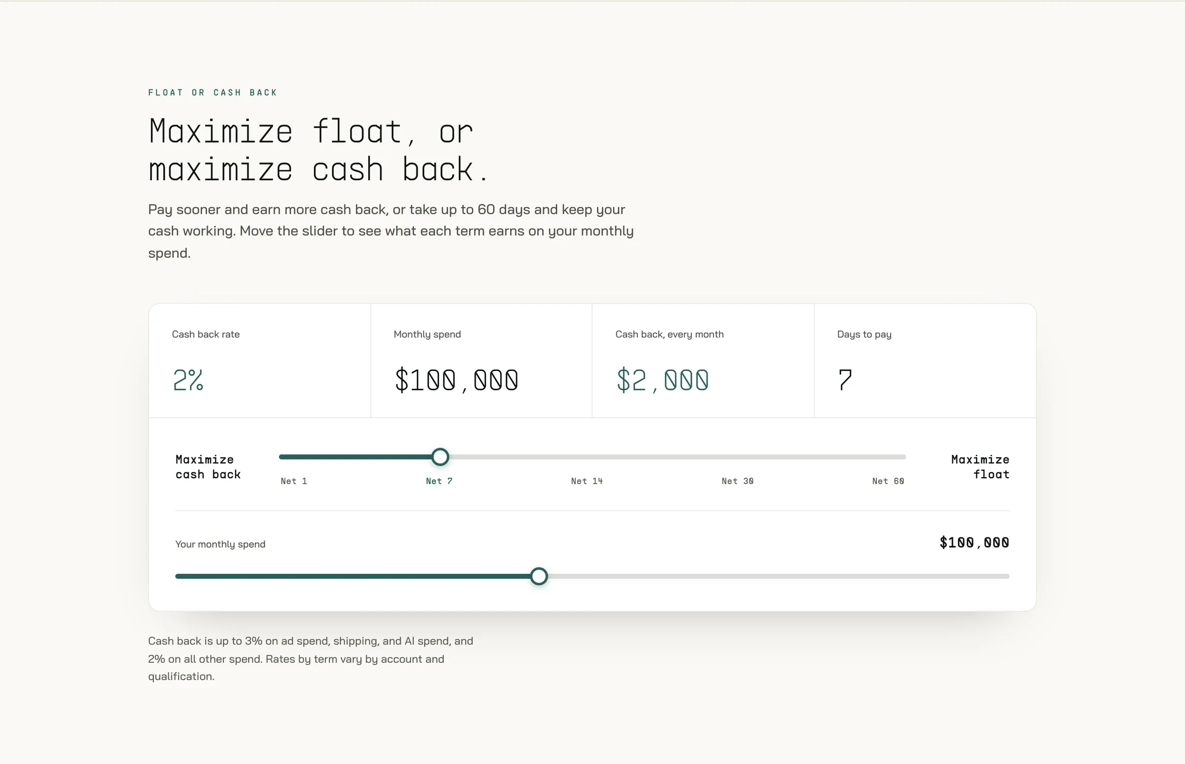
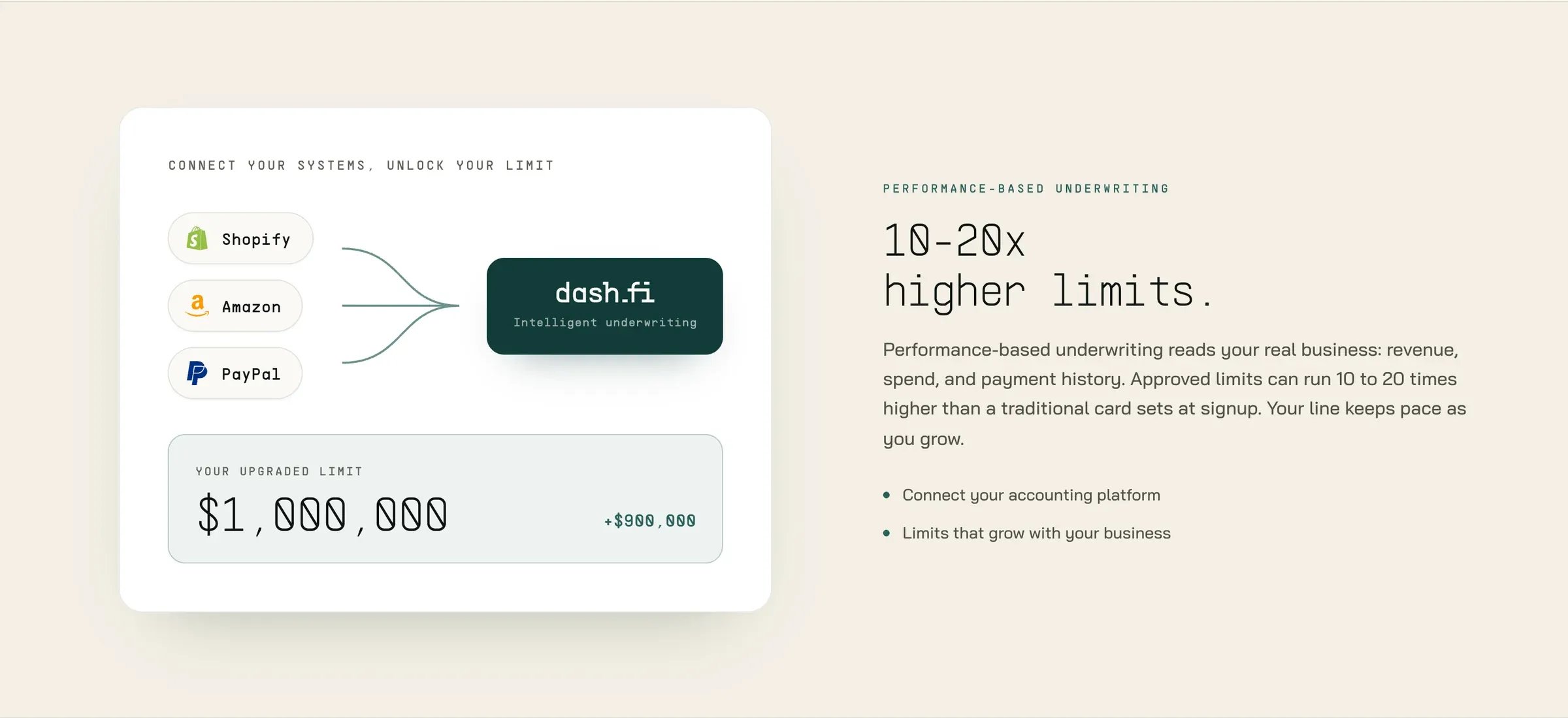
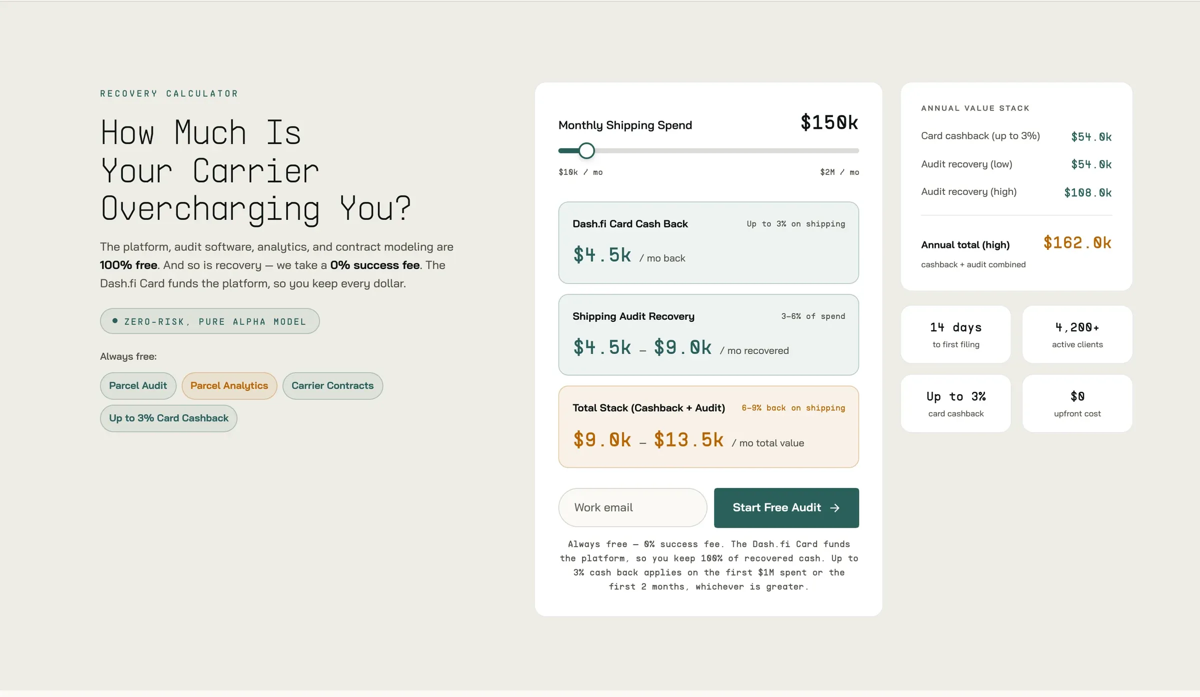
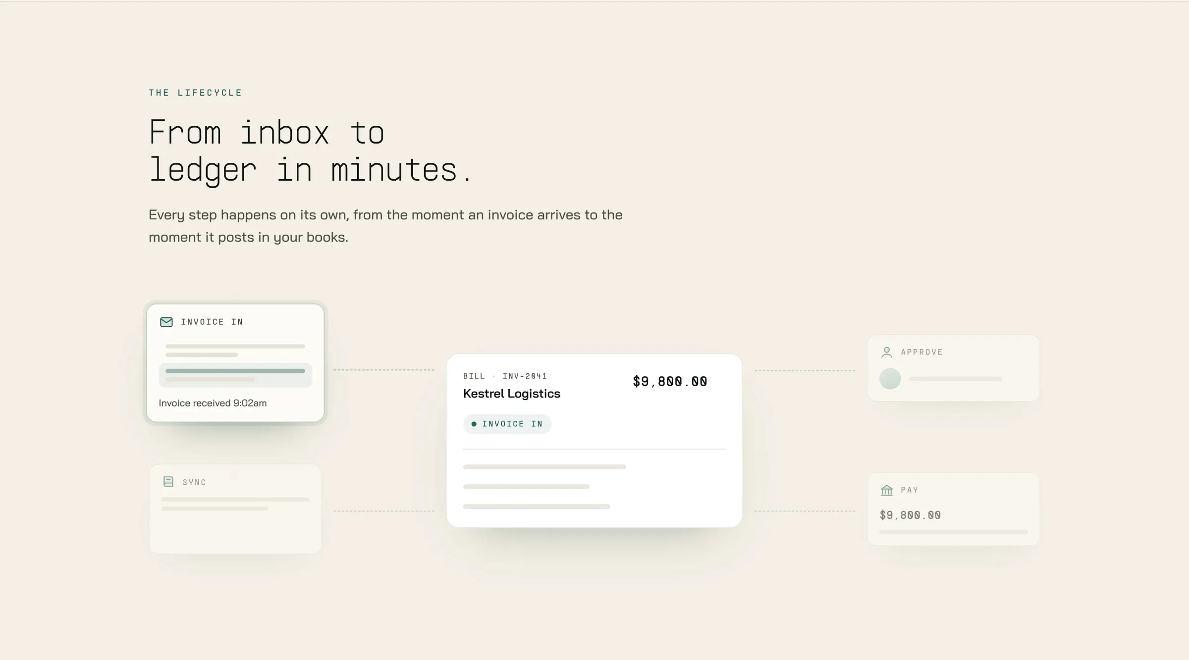
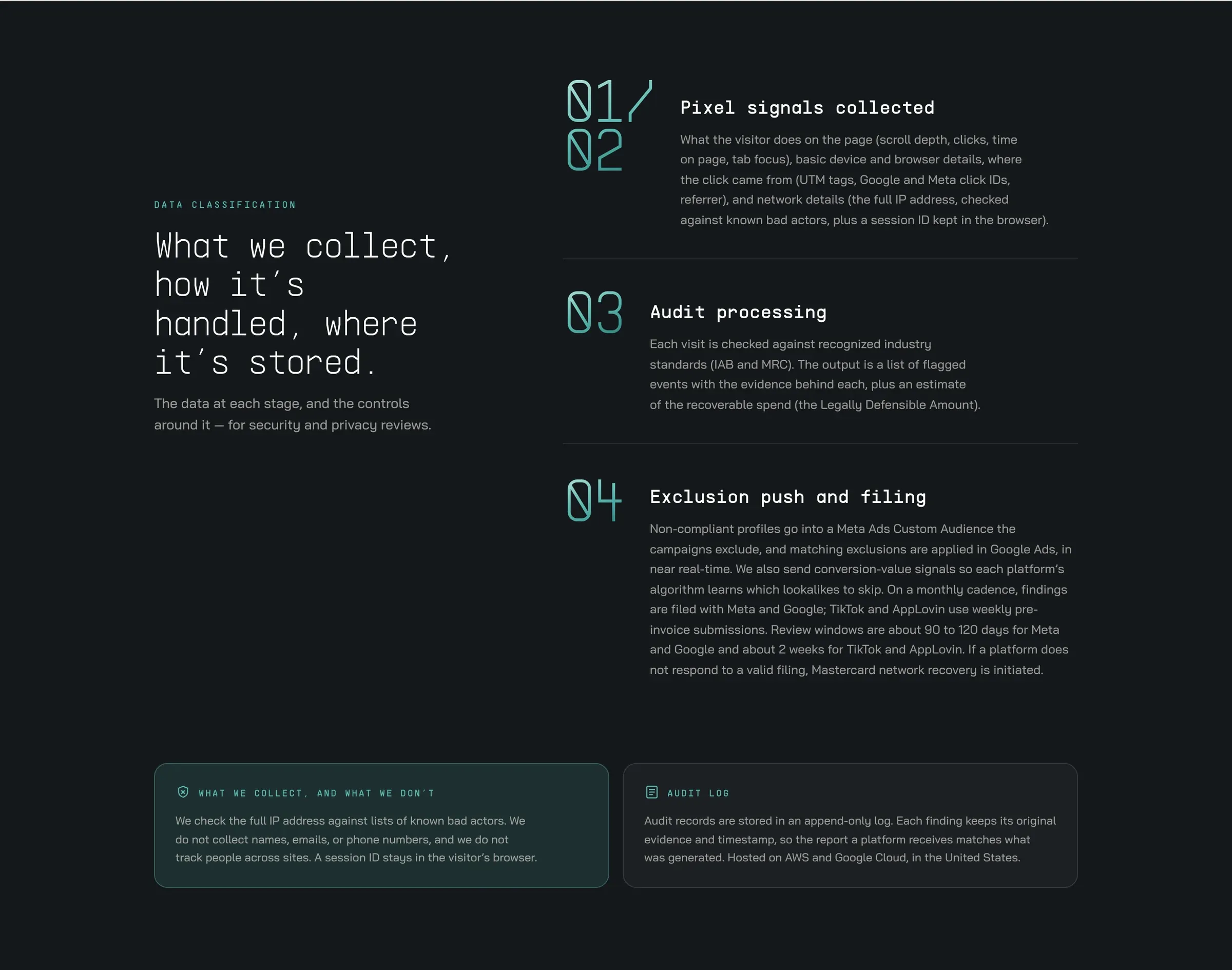
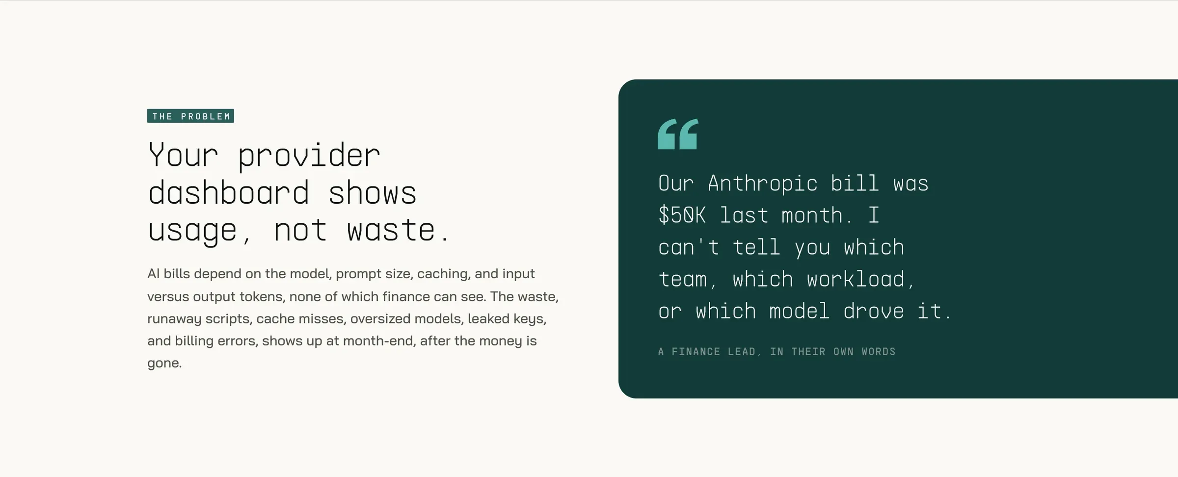
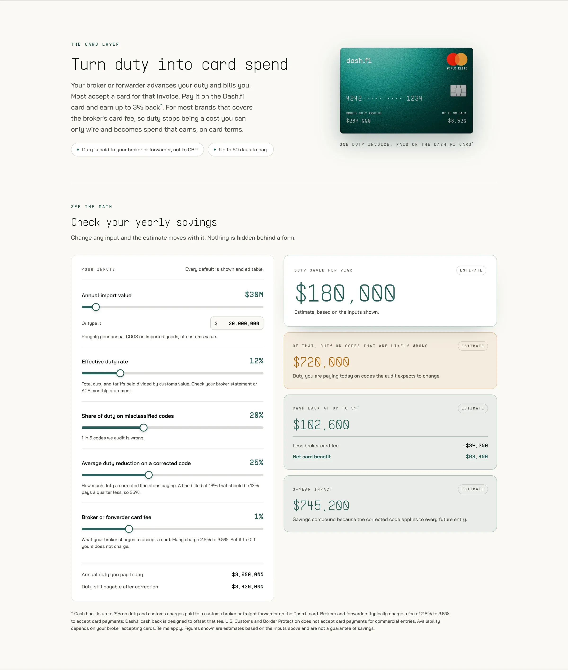
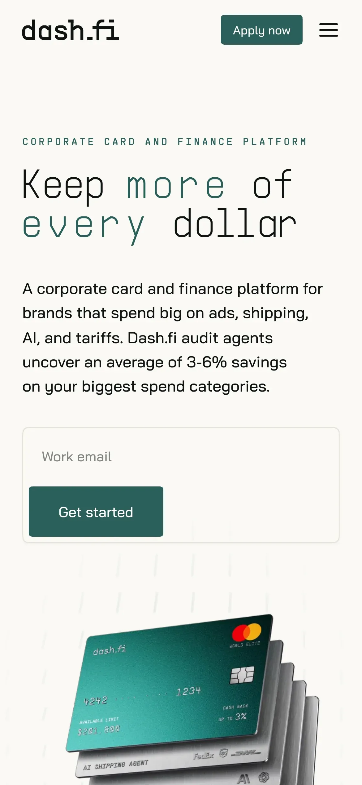
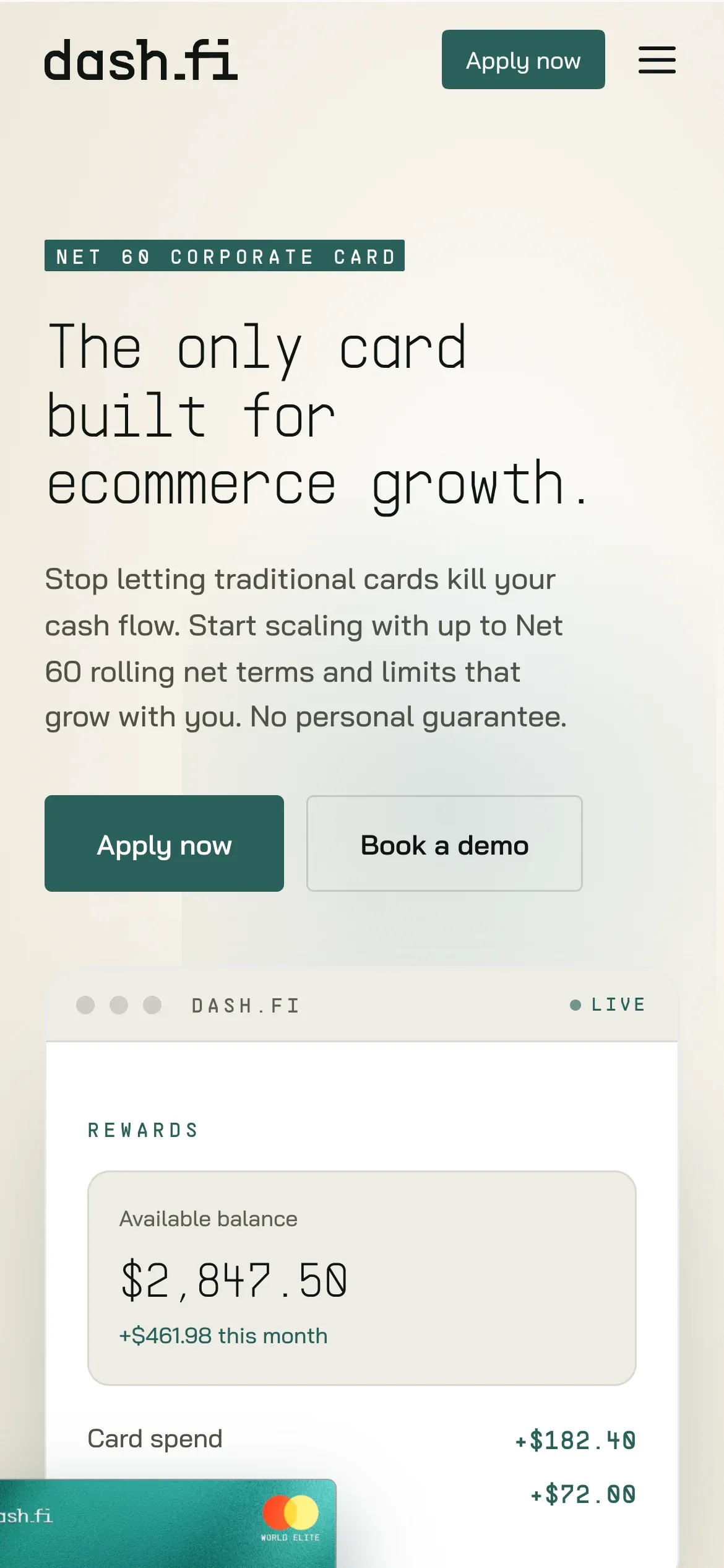
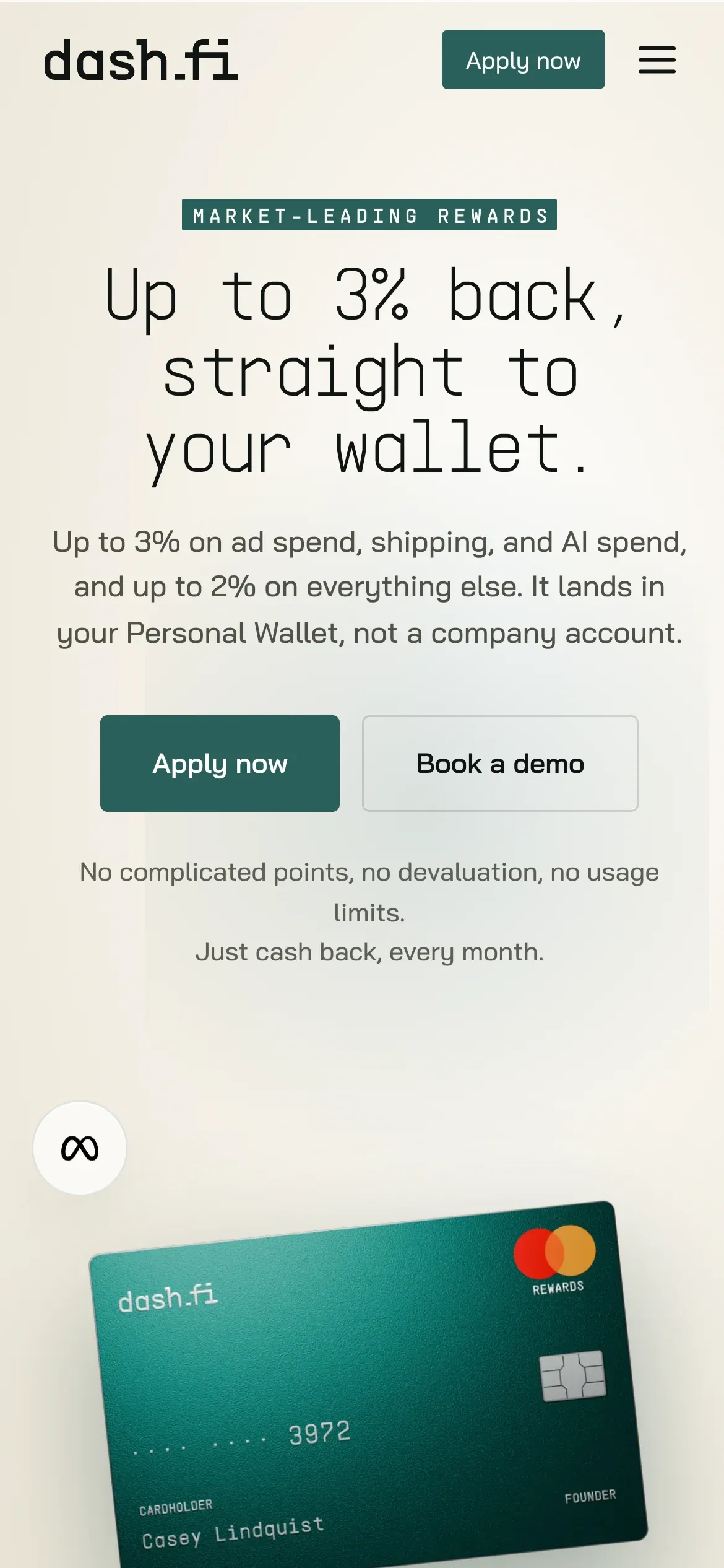
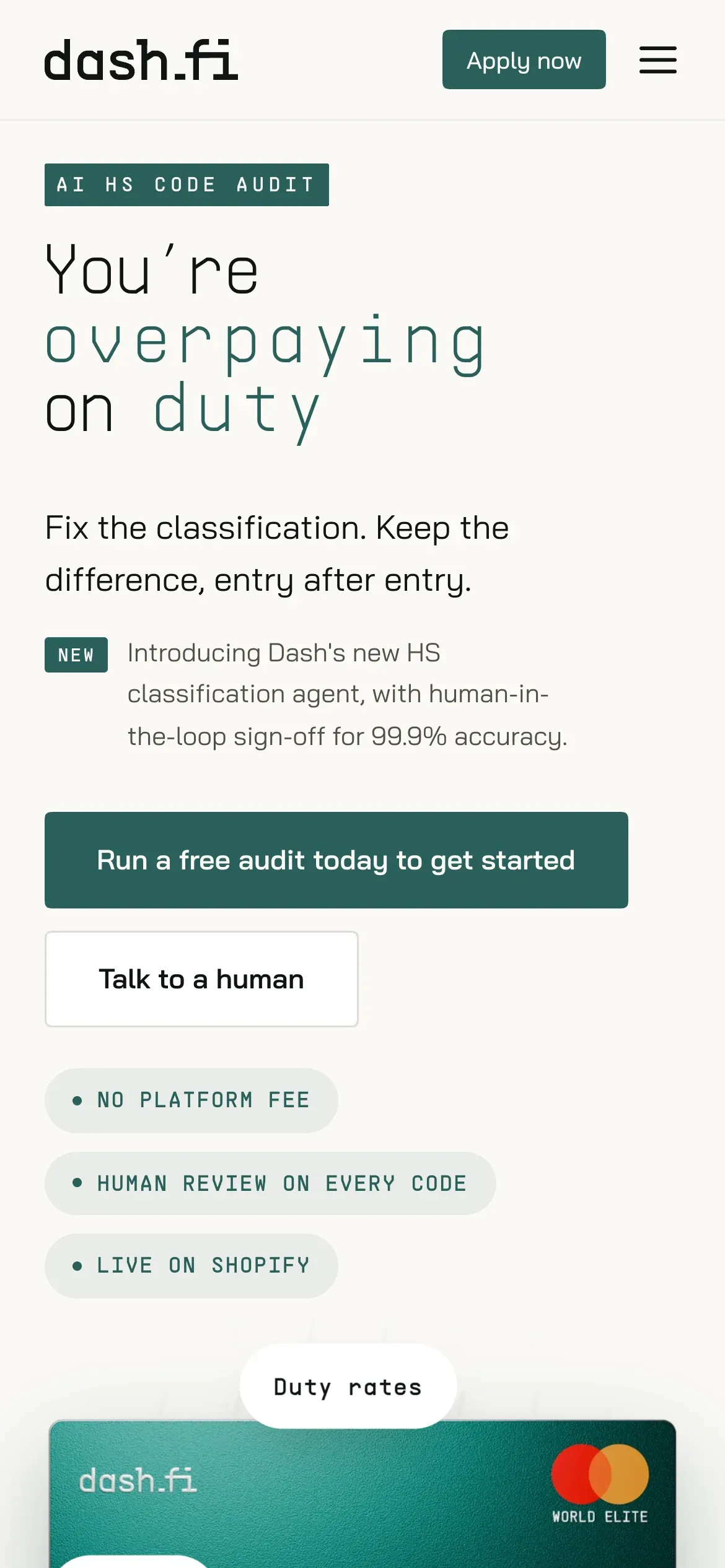
When I took over the site in May 2026 it was dark and electric blue, and the pages didn’t match each other. In about six weeks I moved every page onto the jade language, then turned that look into a named marketing system: shared tokens, one display type voice, one button family, canonical easing.
Motion became the signature — per-letter headline rises, a flipping magnetic card, scroll-drawn diagrams and a WebGL alpha-video hero. Visual-regression and performance checks run on every change so the craft holds up.
04 The agents get faces
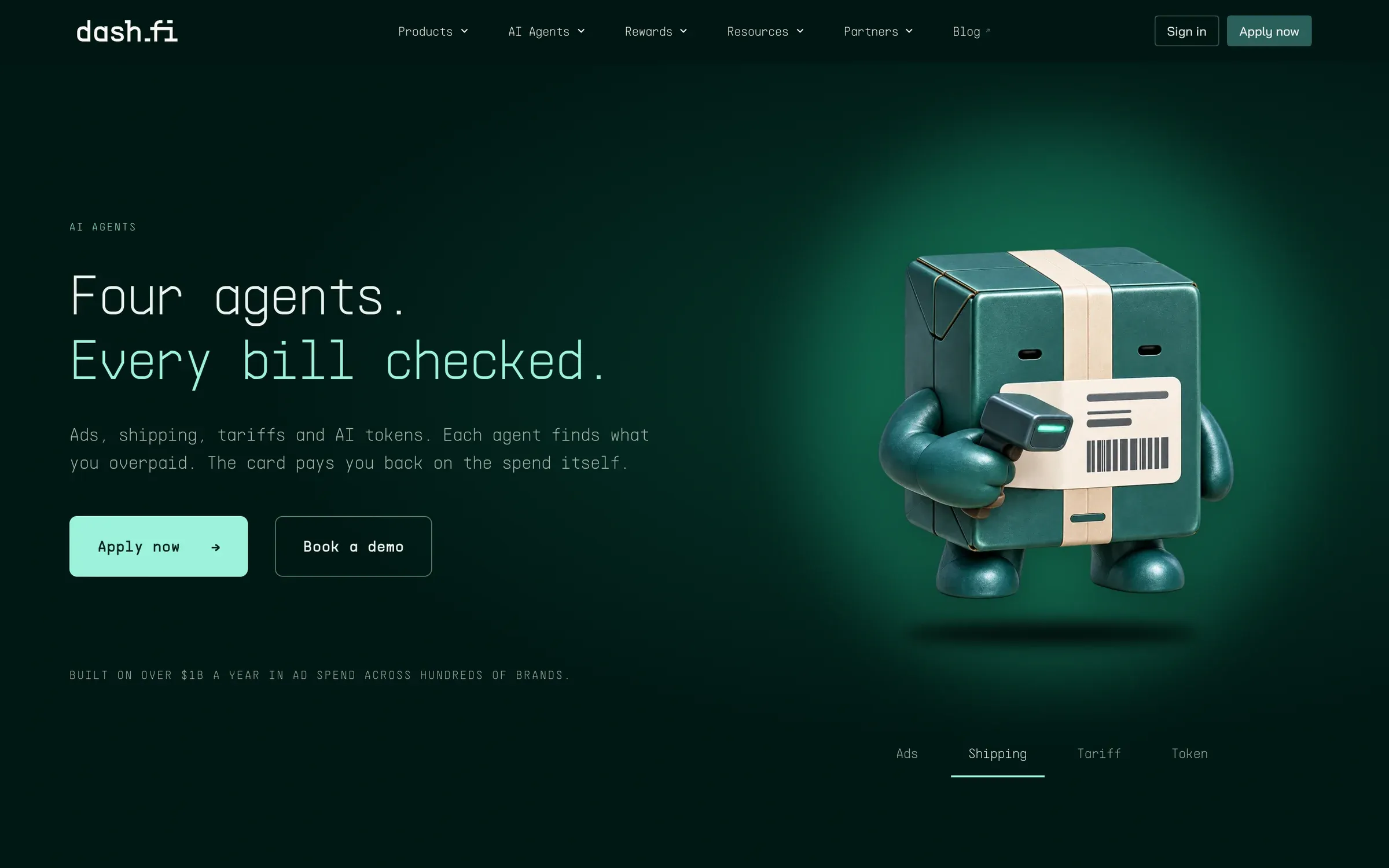
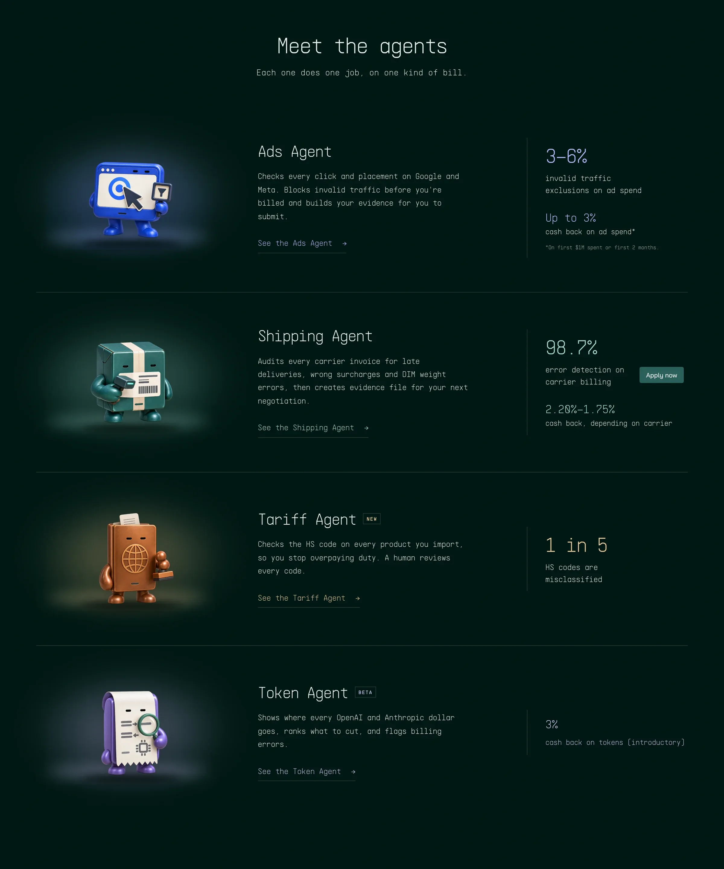
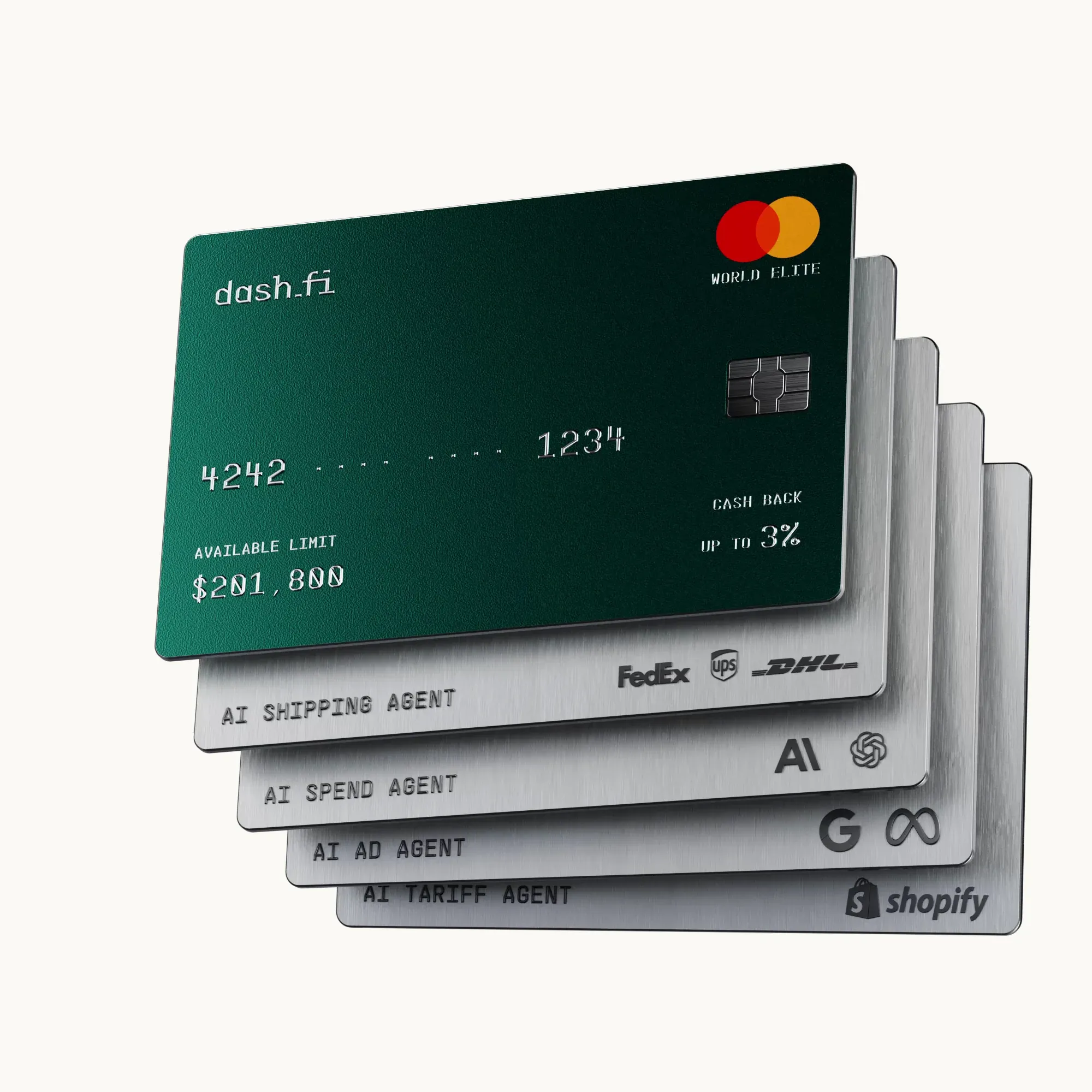
Dash.fi sells four AI audit agents. I gave each one a character and built the identity system that keeps them consistent — the full story is its own case study.
05 Dashbook, a brand system that can’t drift
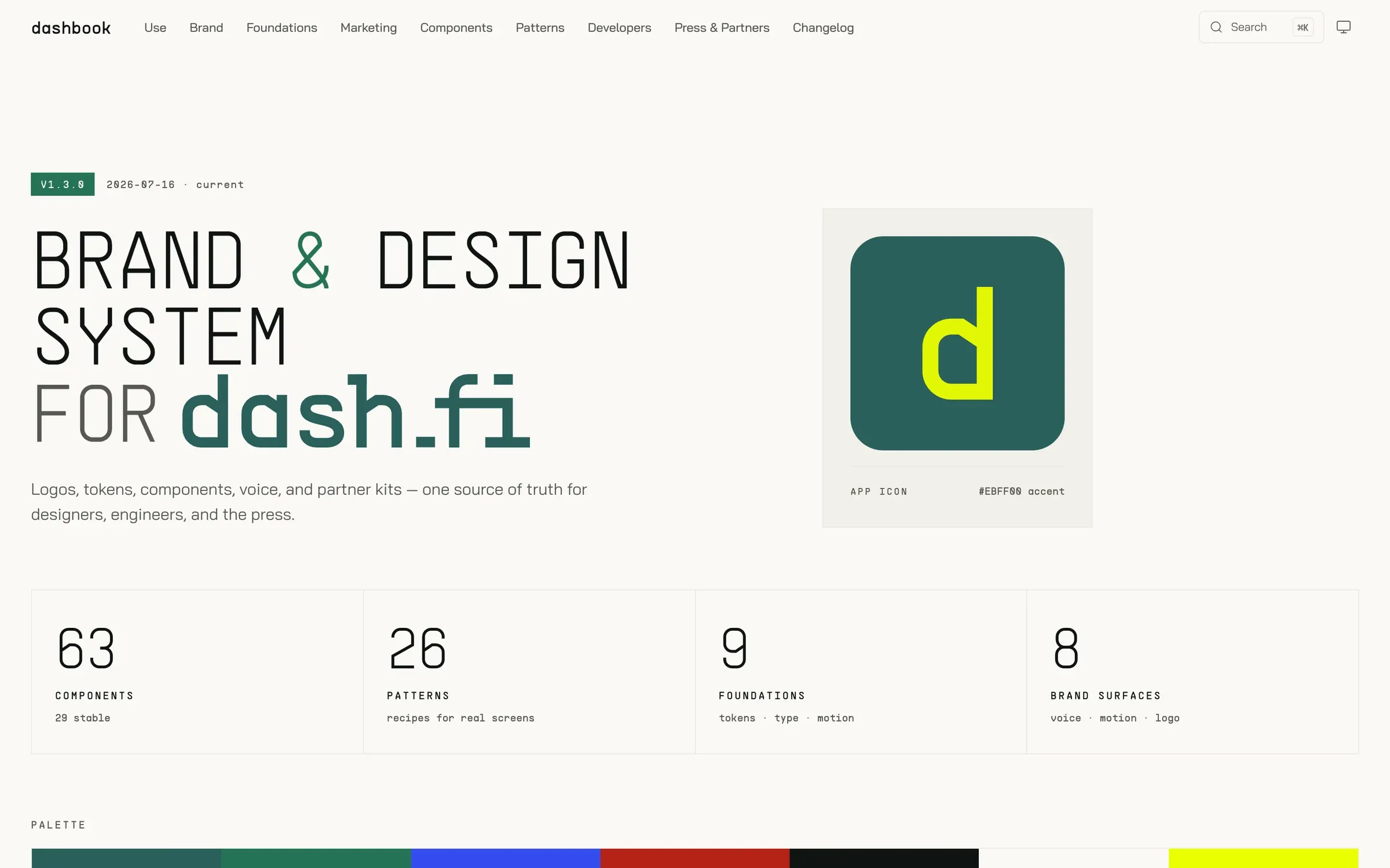
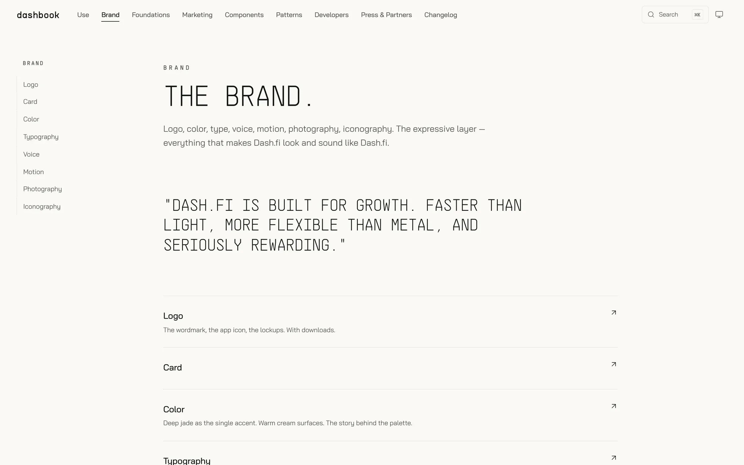
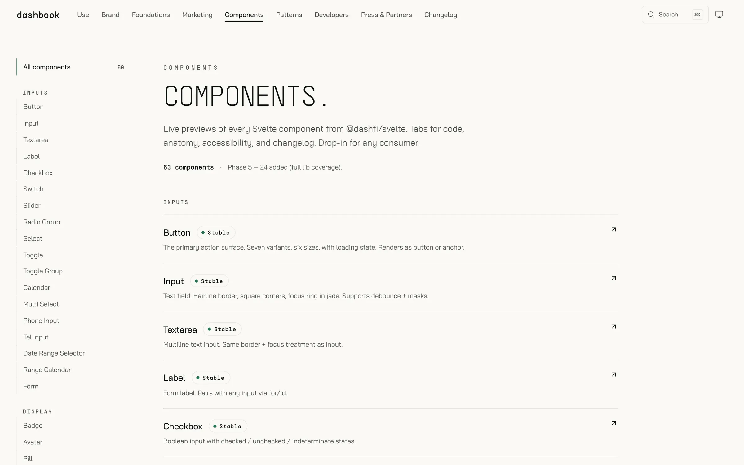
Brand guidelines usually go stale the week after they’re published. Dashbook (brand.dash.fi) is built on the same component library the product ships, so the docs and the product can’t diverge — CI fails a pull request when they disagree. The first audit caught documented radii of 4/6/8 against a rendered 8/10/12/16, and an “AA” contrast claim that measured 4.28:1.
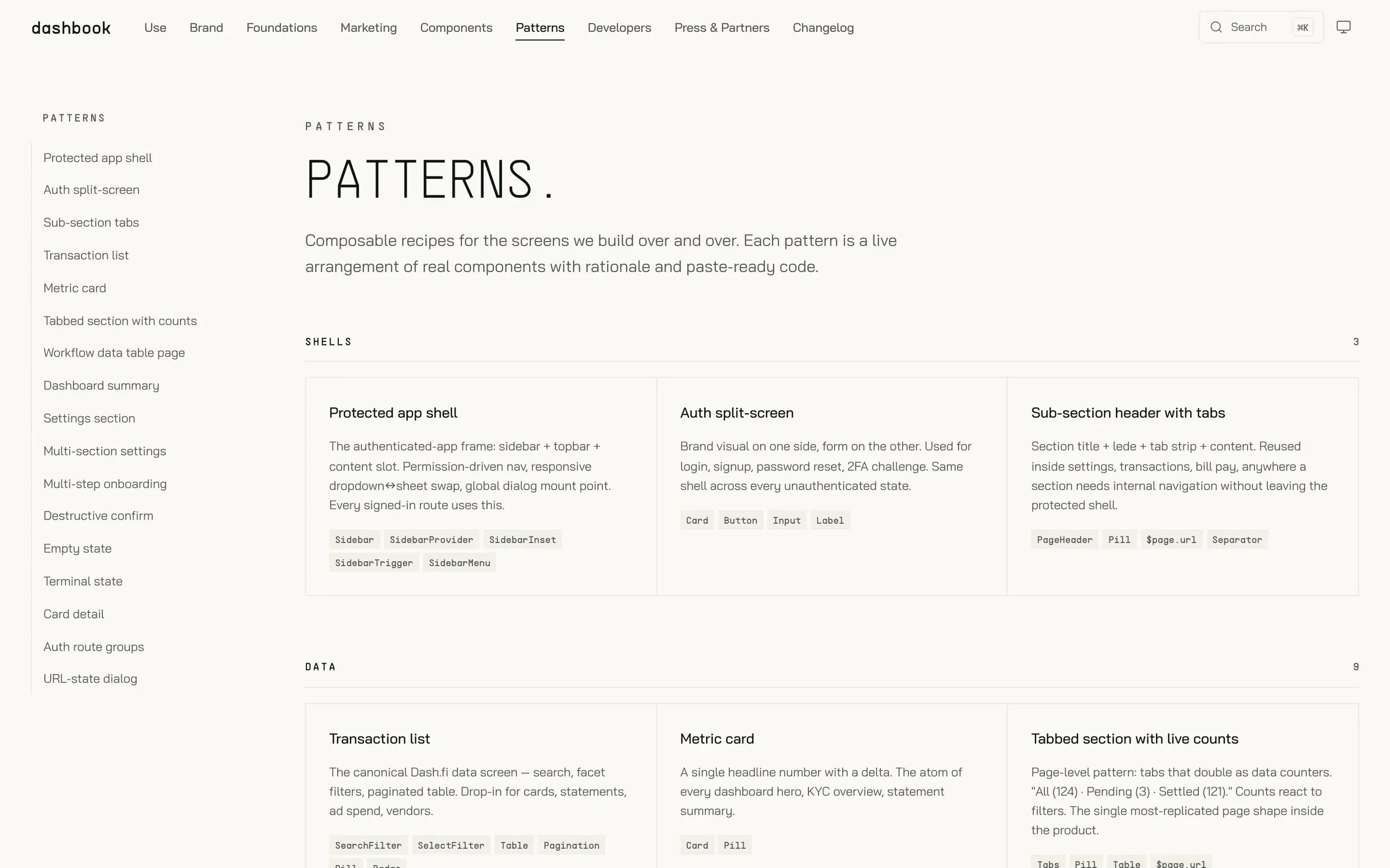
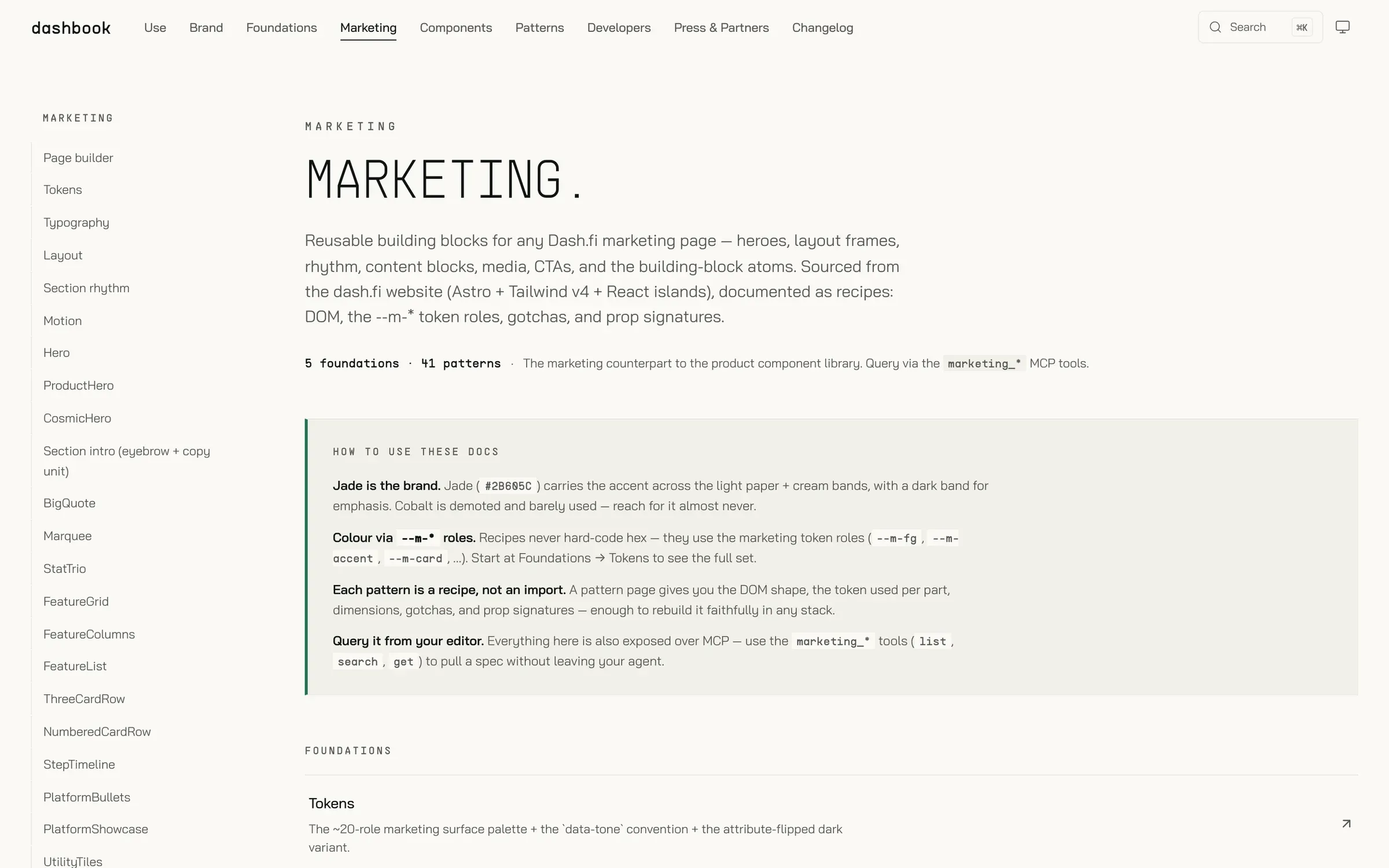
It holds the logos, tokens, voice rules, legal copy, partner kits, 63 components, 26 product patterns and 41 marketing patterns. An MCP server and a company-wide Claude plugin give coding agents the brand directly. The same system carries a second brand: one attribute switches palette, type, corners, shadows, logos and the auth shell.
06 Direction
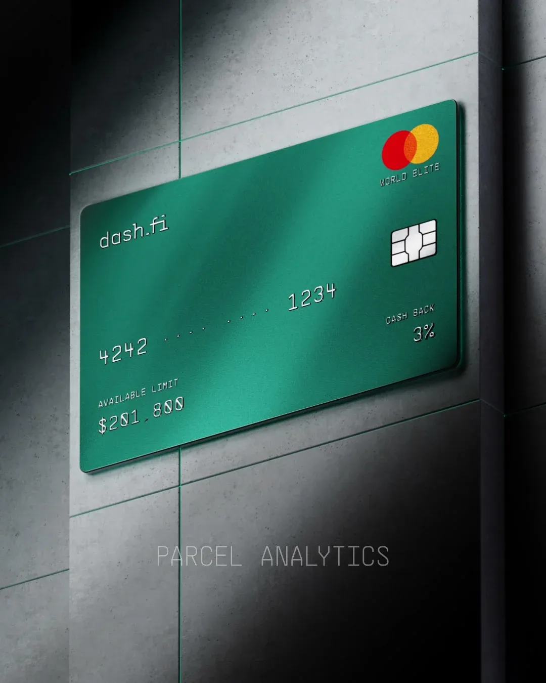
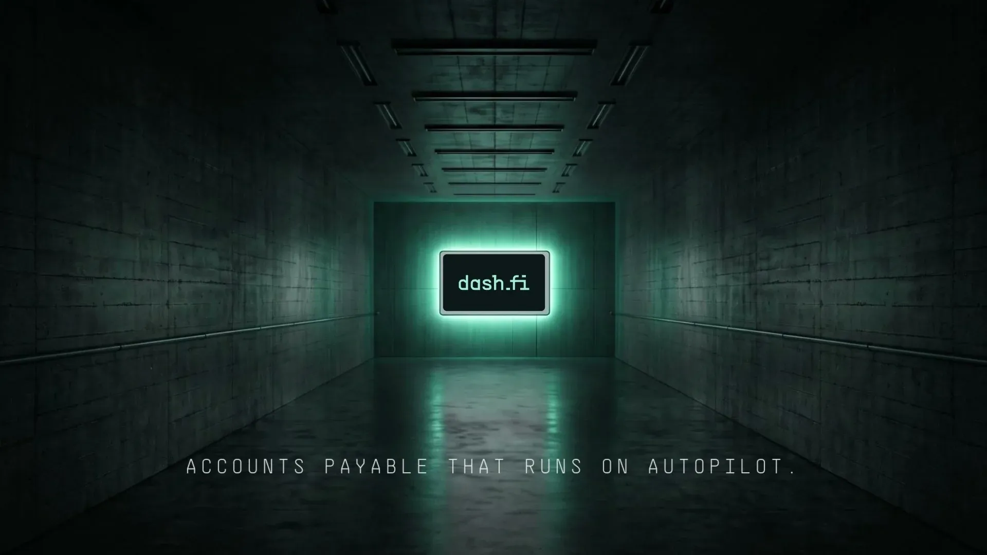
How the brand looks is how I directed it, whoever or whatever made a given piece. I write the briefs, set the look, choose the materials and approve every frame. The jade card and agent renders are by a 3D artist working to my direction.
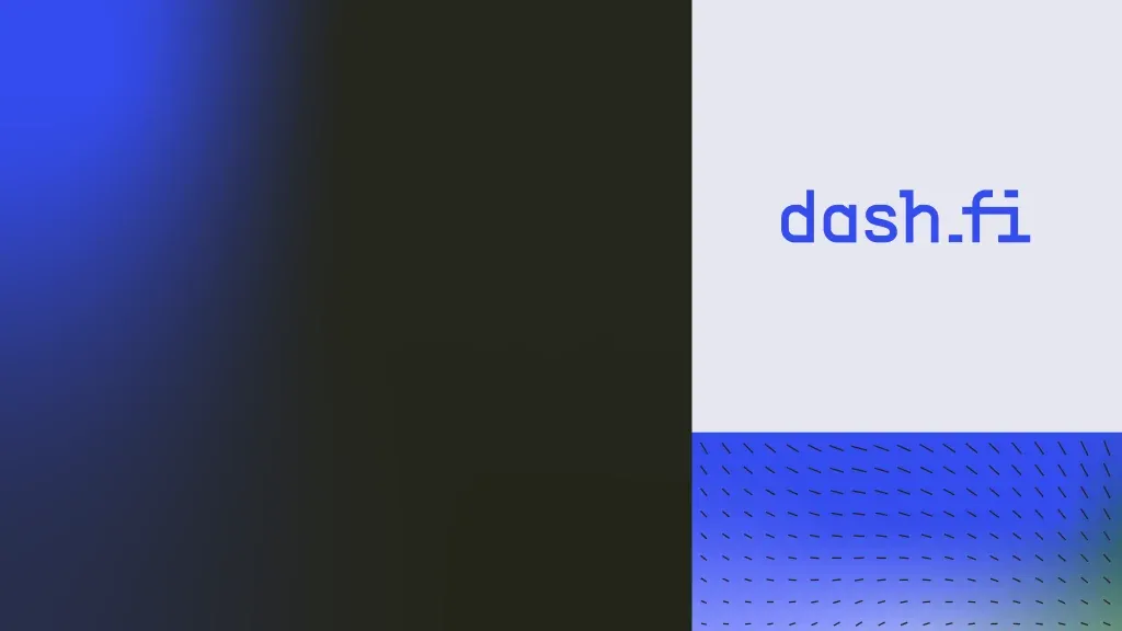
The arc: a cobalt identity in 2025 — mono wordmark, morse-code and dash-field devices — into jade in 2026: warm paper, ultralight mono display, a jade card against brushed metal and concrete.
07 How I work
- One owner for how it looks. Every visual decision goes through one point of view, so Dash.fi looks like one company.
- Design lands as code. I build the front-end myself, so nothing gets lost in handoff and the details survive into production.
- Systems that hold. Tokens, a shared library, CI that keeps the docs honest, guardrails on the site.
- The right maker for each job. A 3D artist, the team, AI tools, my own hands — I pick the tool, and the result answers to the direction.